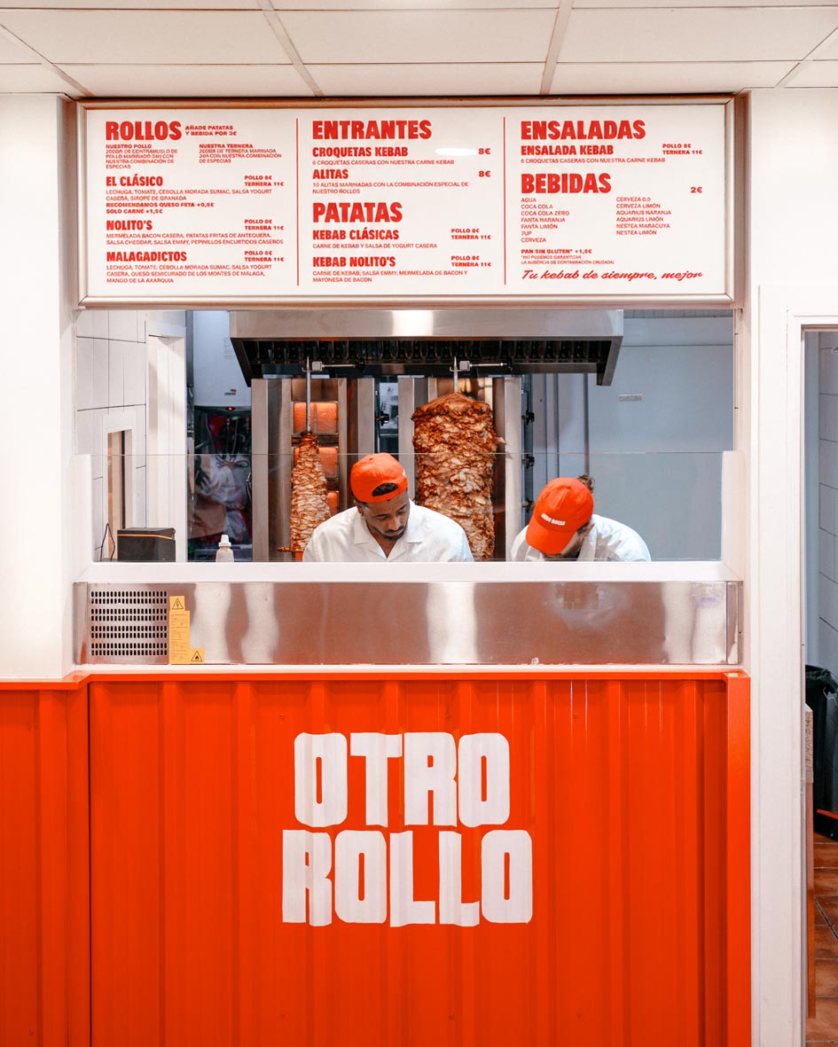
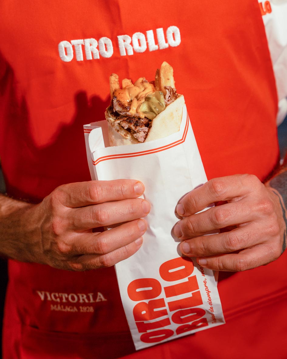
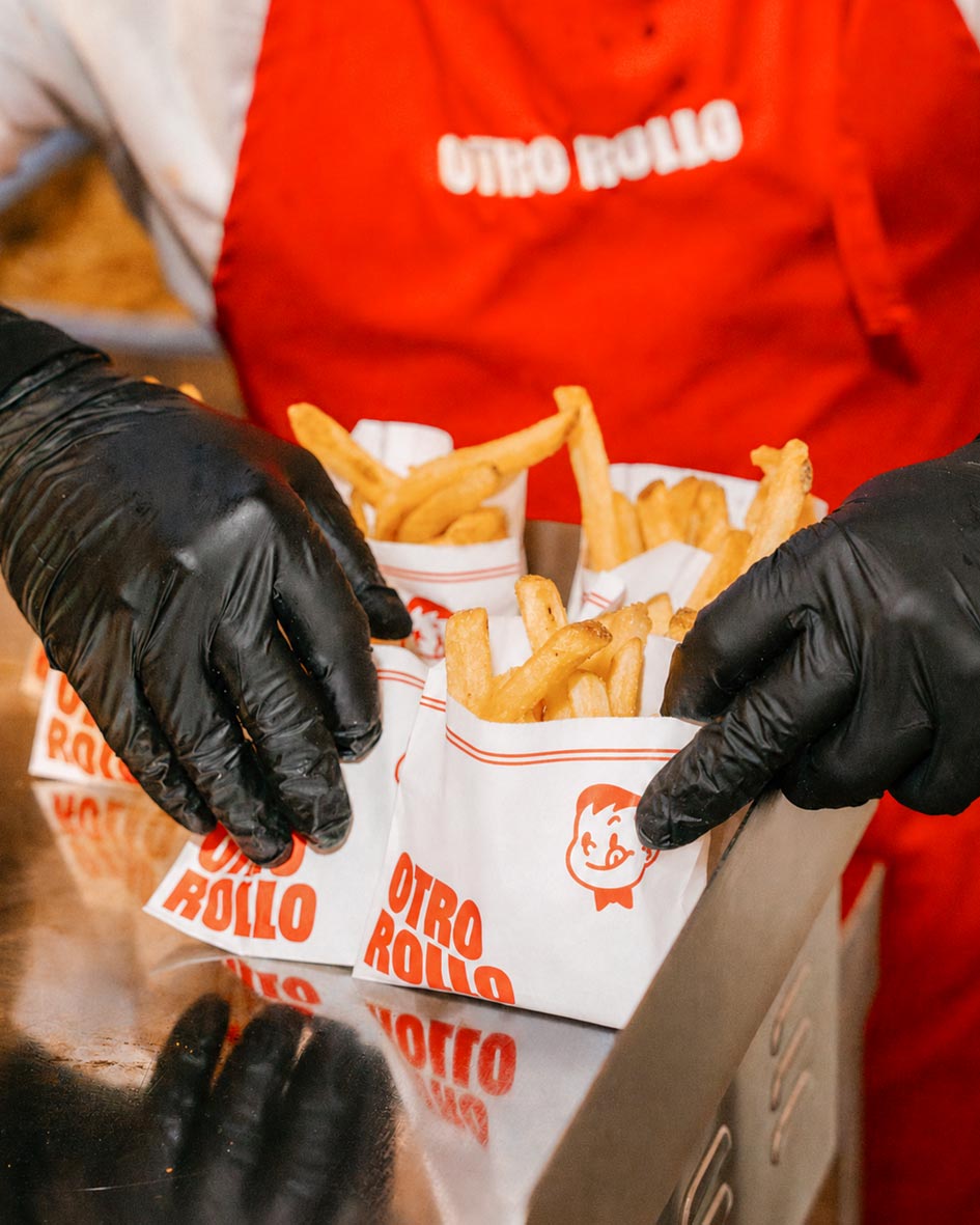
A new kebab joint that wants to make the kebab we all know and love, but with high quality ingredients: the classic kebab experience in Málaga, with every detail taken care of, without changing the kebab at its roots but respecting it. That called for a brand with the warmth of classic neighbourhood, low ticket businesses, like family owned burger, kebab or sandwich places, but looking like every detail was truly considered, with fresh ingredients and homemade elaborations. The brand had to be easy to apply and straightforward, so they could use it without losing consistency or spending extra time and/or money on every application.
The Positioning
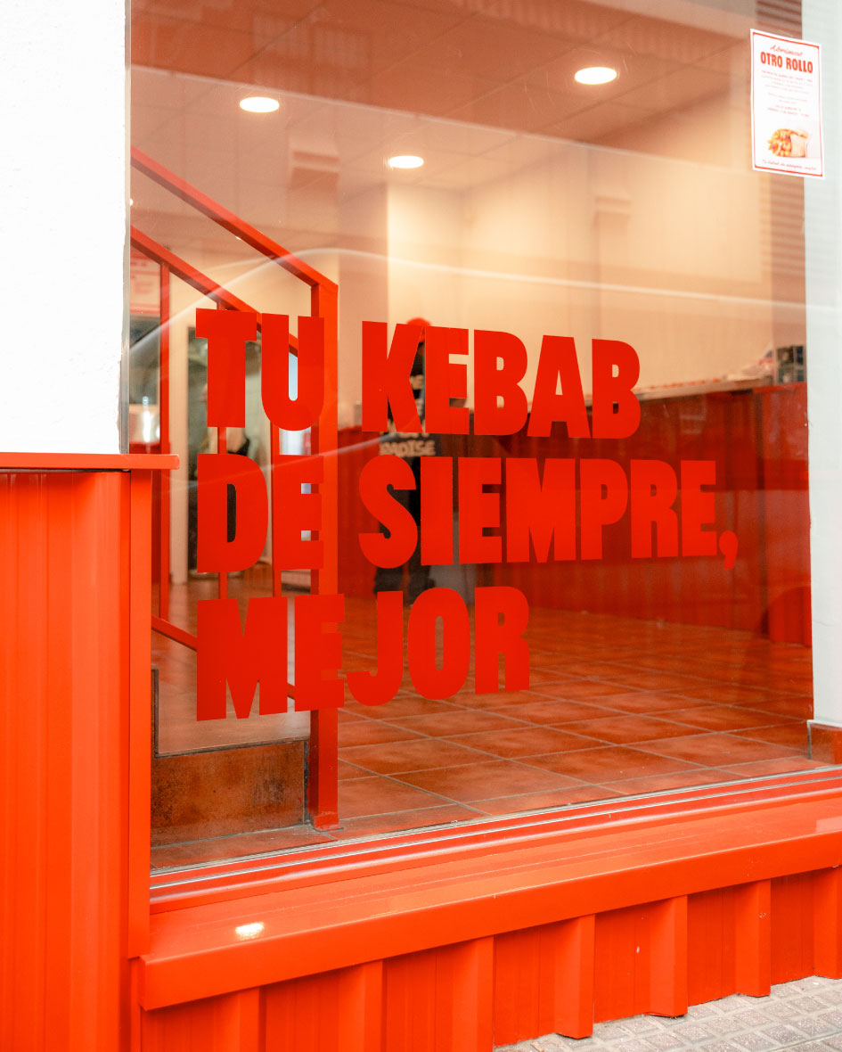
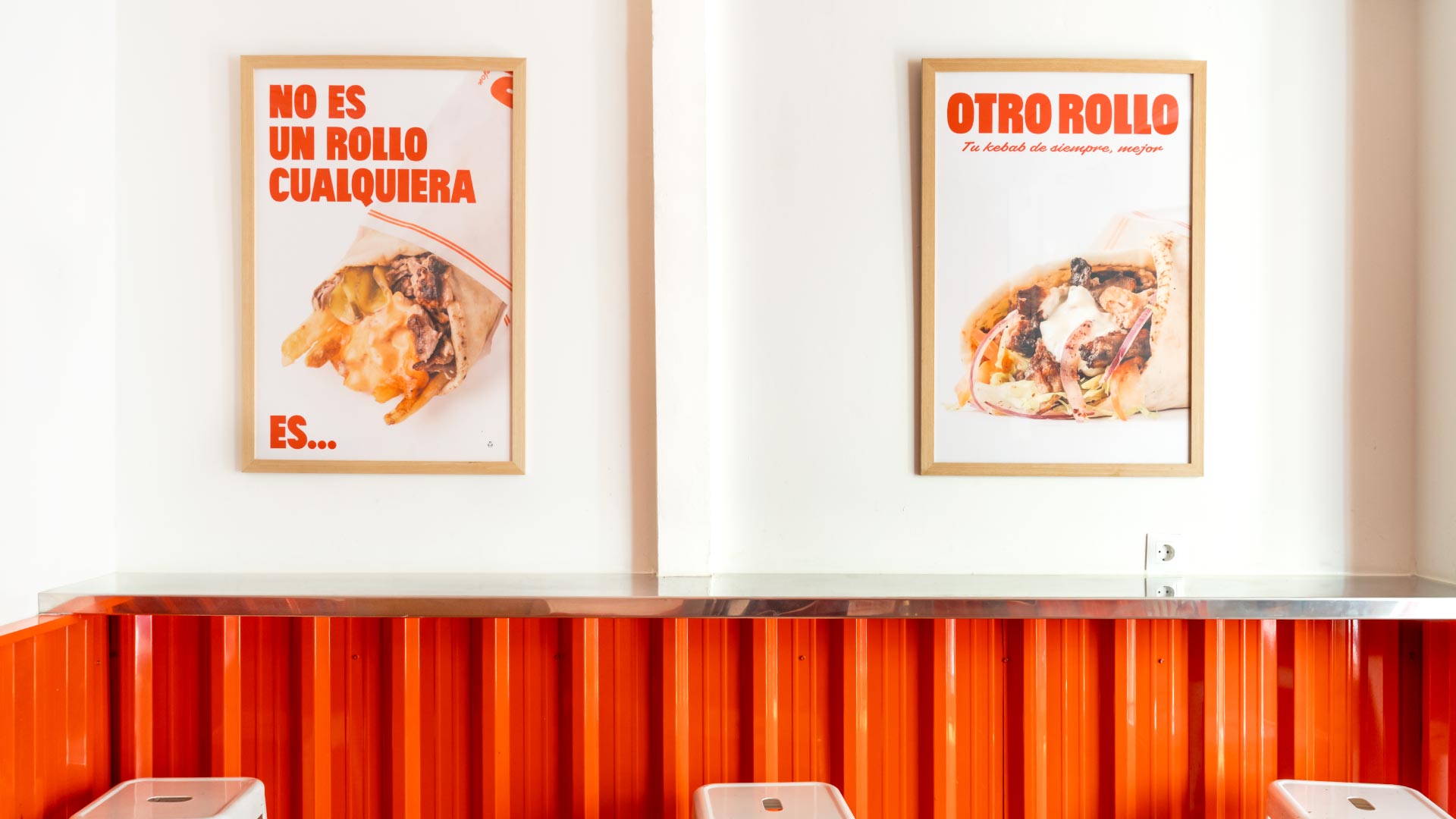
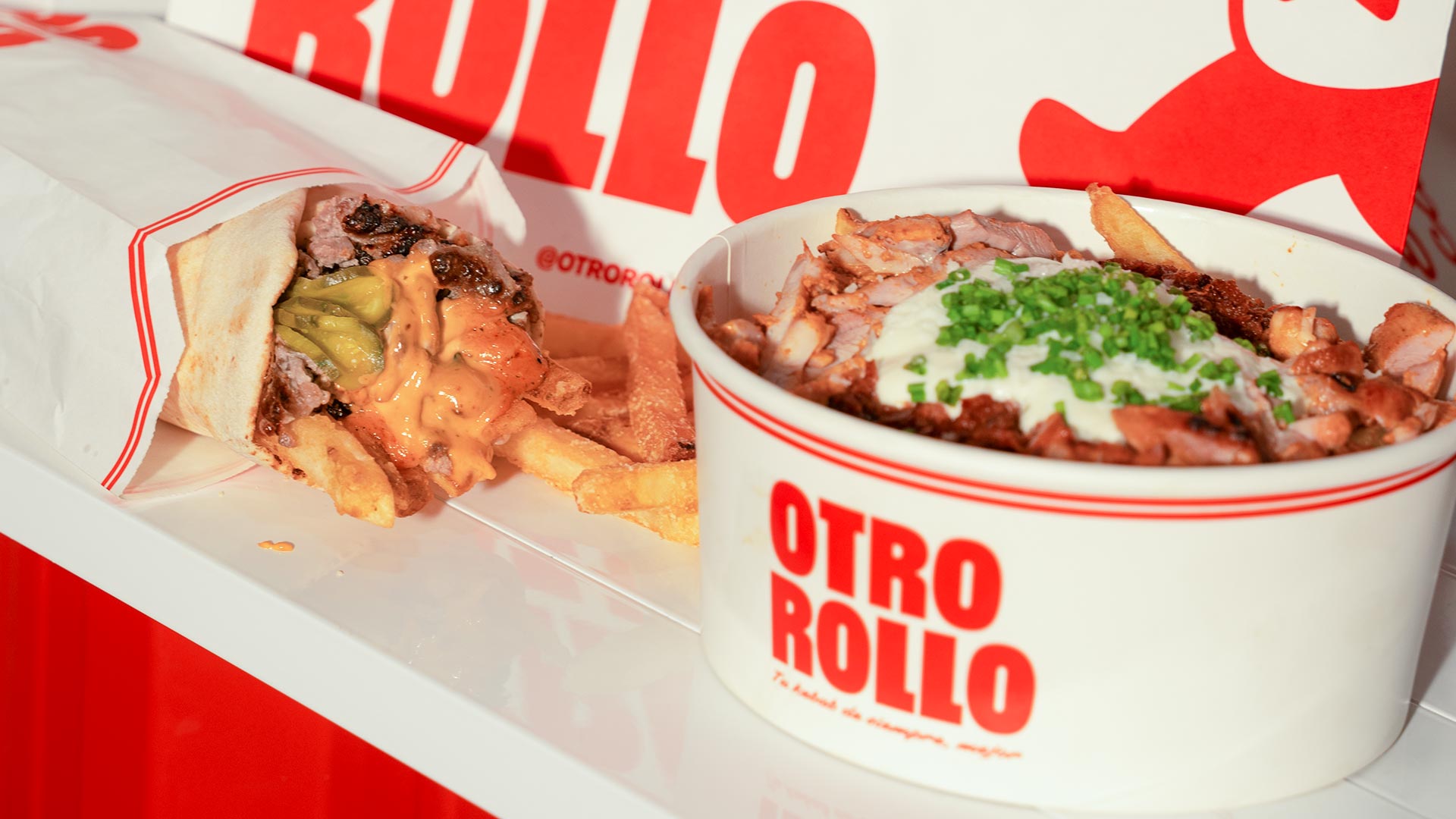
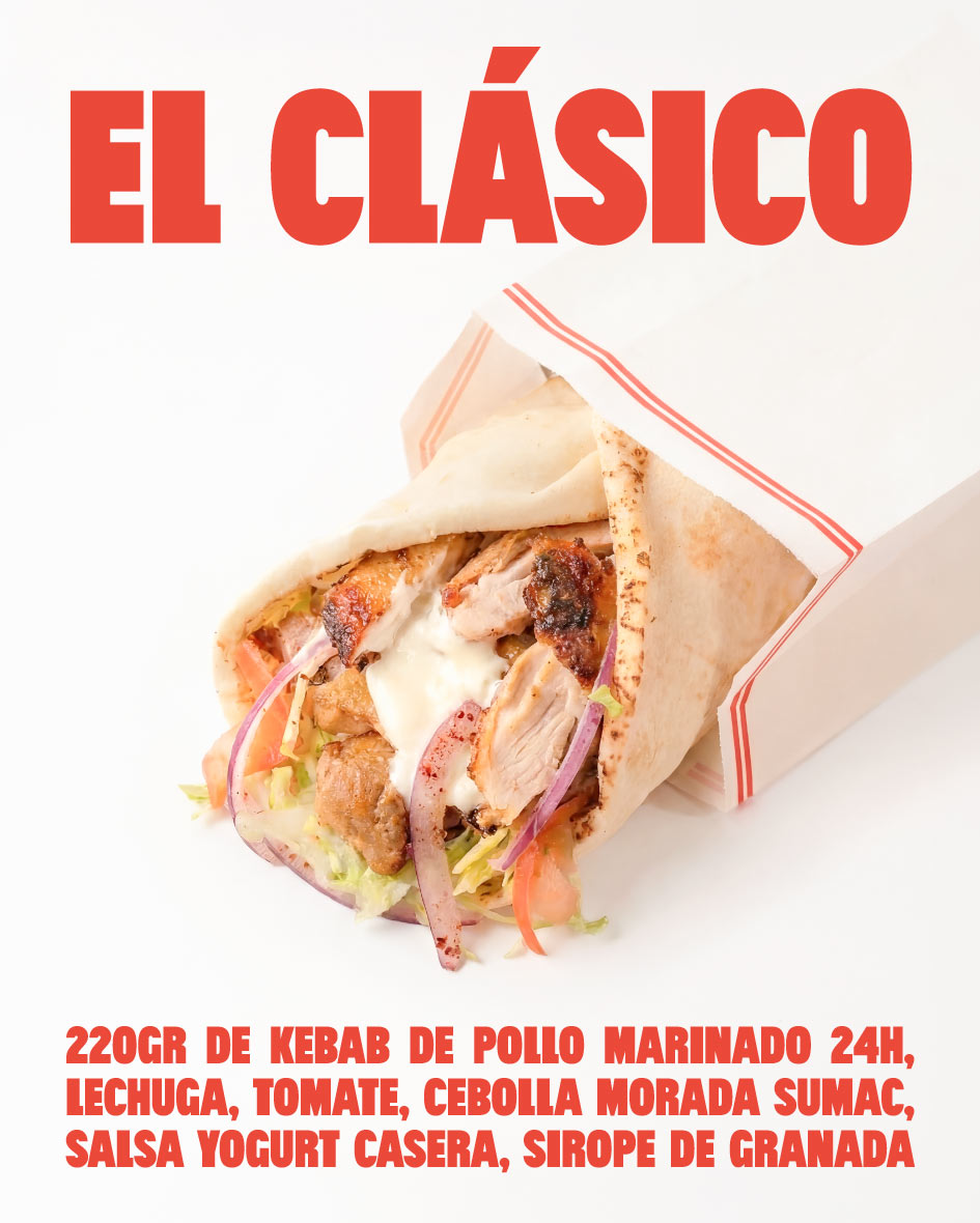
The kebab we all know, but better. Under that claim, we express that we’re not here to reinvent the kebab world, but to give it a bit more justice: the meat is real meat, the lettuce, tomato and vegetables are fresh, and the pickles, potatoes and other ingredients are cut, pickled and/or prepared in house. The interior is inspired by fast food kebab joints but with a minimal and elegant twist, keeping what sets them apart (menú, photographs, being able to choose the vegetables at the counter…) while removing the noise. Otro Rollo had to feel like a familiar place, elevated.
The identity
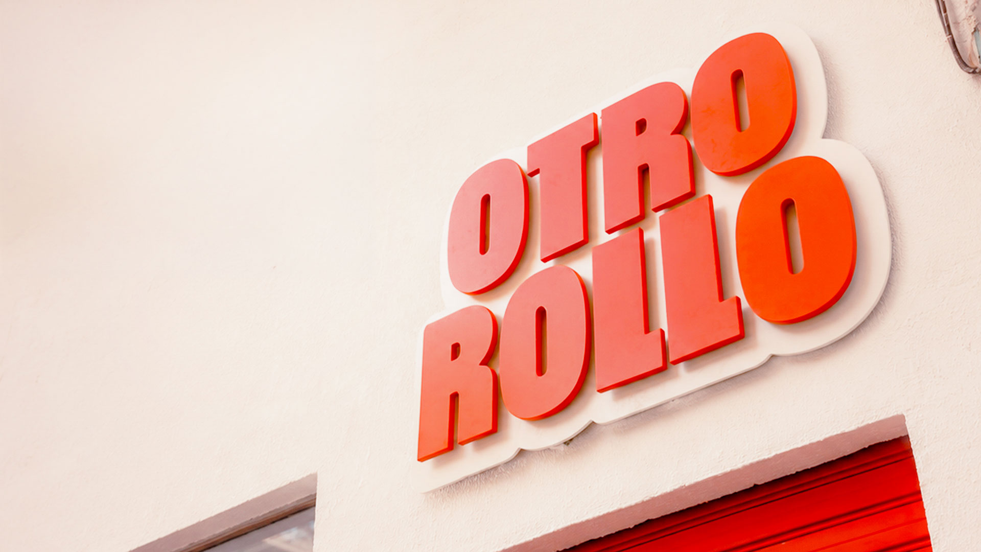
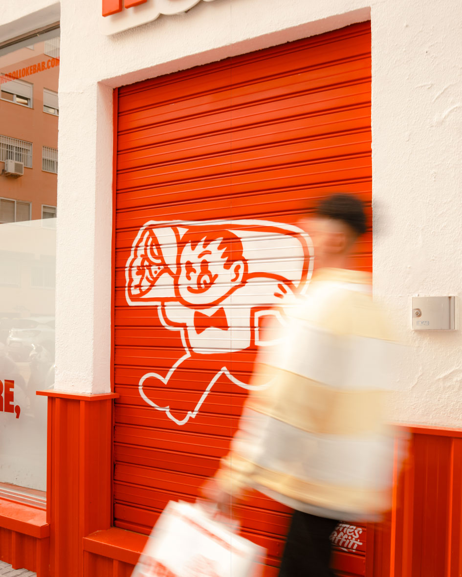
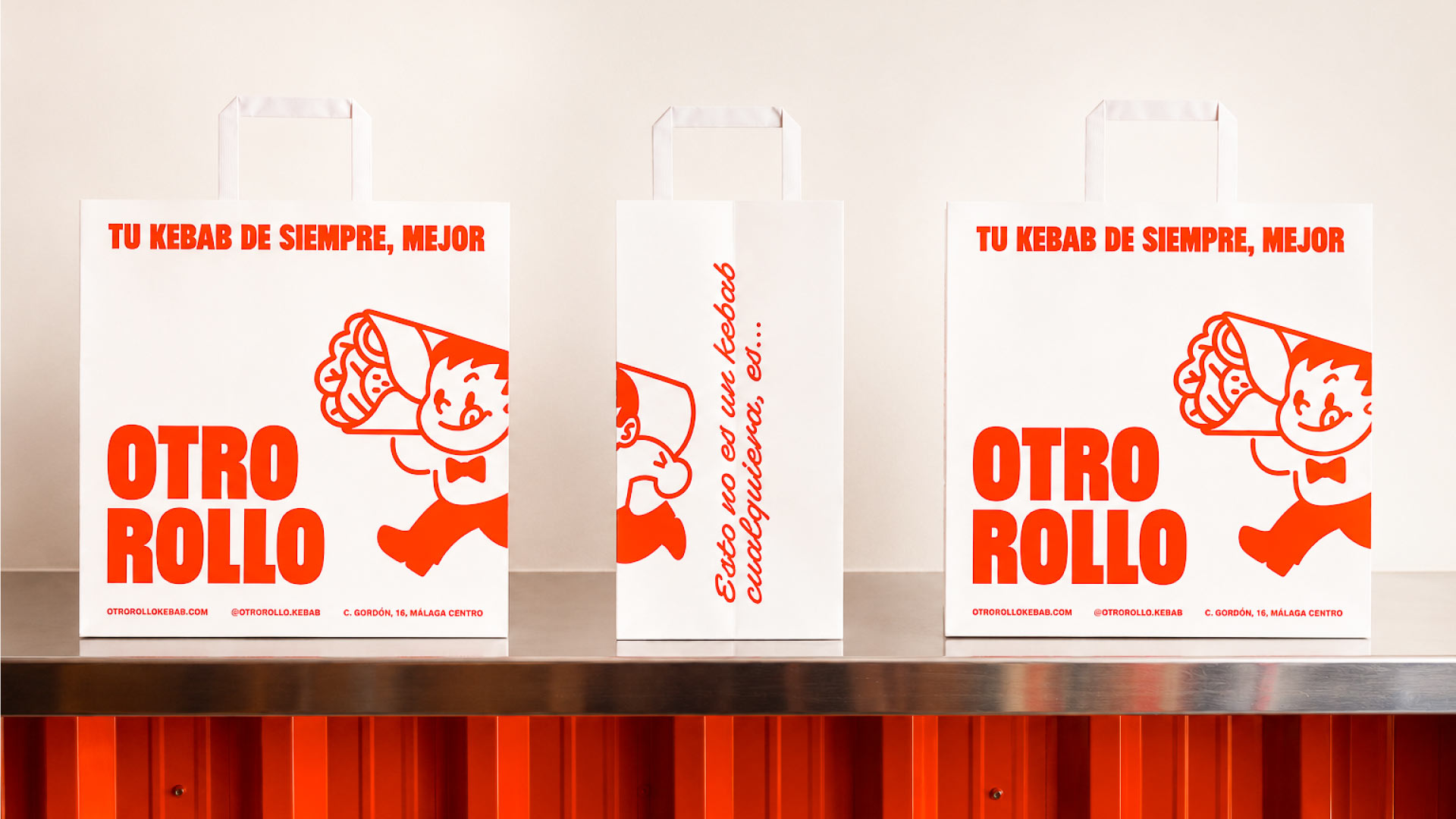
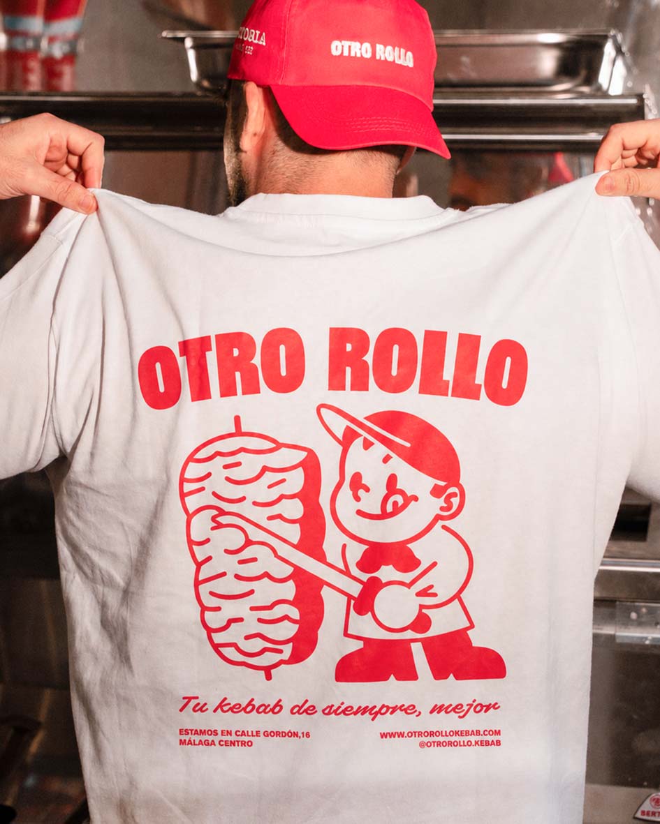
A combination between a London or New York high end deli and a classic “campero” joint from the neighbourhood. In Málaga, most burger and “campero” places have a mascot and a reduced menú; we took that, combined it with a kebab, and simplified everything down to two colours, two fonts, the mascot and a bold, direct logo, conveying warmth, elegance and care. We focused on bold, direct compositions built around the main typeface “Buzz,” sometimes paired with the script “Superetta” for that extra human touch, but more elegant. The mascot inspired by Málaga’s classic waiters carrying a kebab reinforces the local aspect of the place and gives emphasis to the delivery aspect of Otro Rollo.
The result
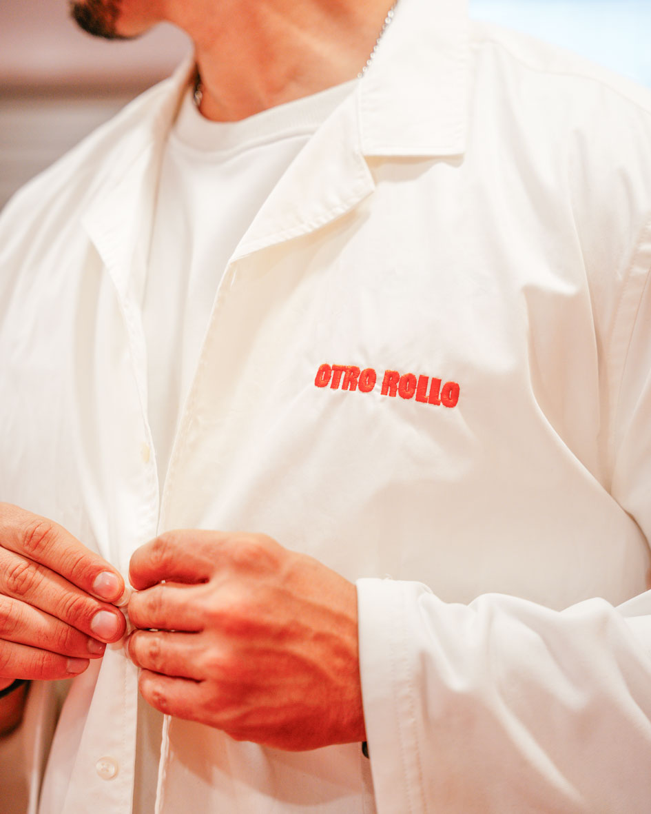
In line with the values of the food, the branding conveys care, attention to detail and humility, feeling like a natural extension of the brand’s core. The packaging adds a layer of value to the product without distracting from what matters or creating noise: a brand that serves as a stage for a high quality kebab, without inflating its perception and/or price with fake brand value, but staying true to its core values instead.
Brief and Foundation
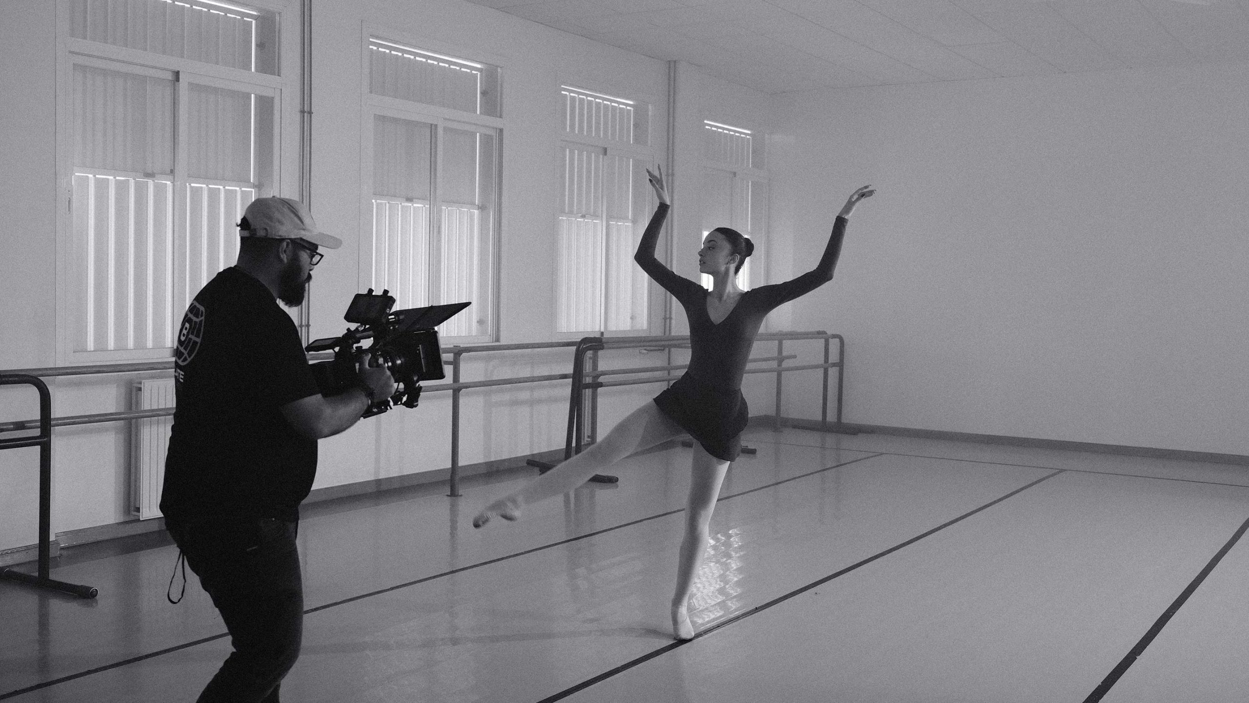
Pola had been running productions for years, but without a brand to match. He needed more than a logo, he needed a system that would let him show up as a production company, not just a freelancer. The goal: structure that could grow with him, and an identity that reflected the work he was already doing.
He knew the name: Balate. A rustic stone wall built to level sloped terrain, the perfect metaphor for a team that handles the complexity of production so content can flow without friction. From that name came a clear creative brief: precision, efficiency, and results that land.
The Positioning
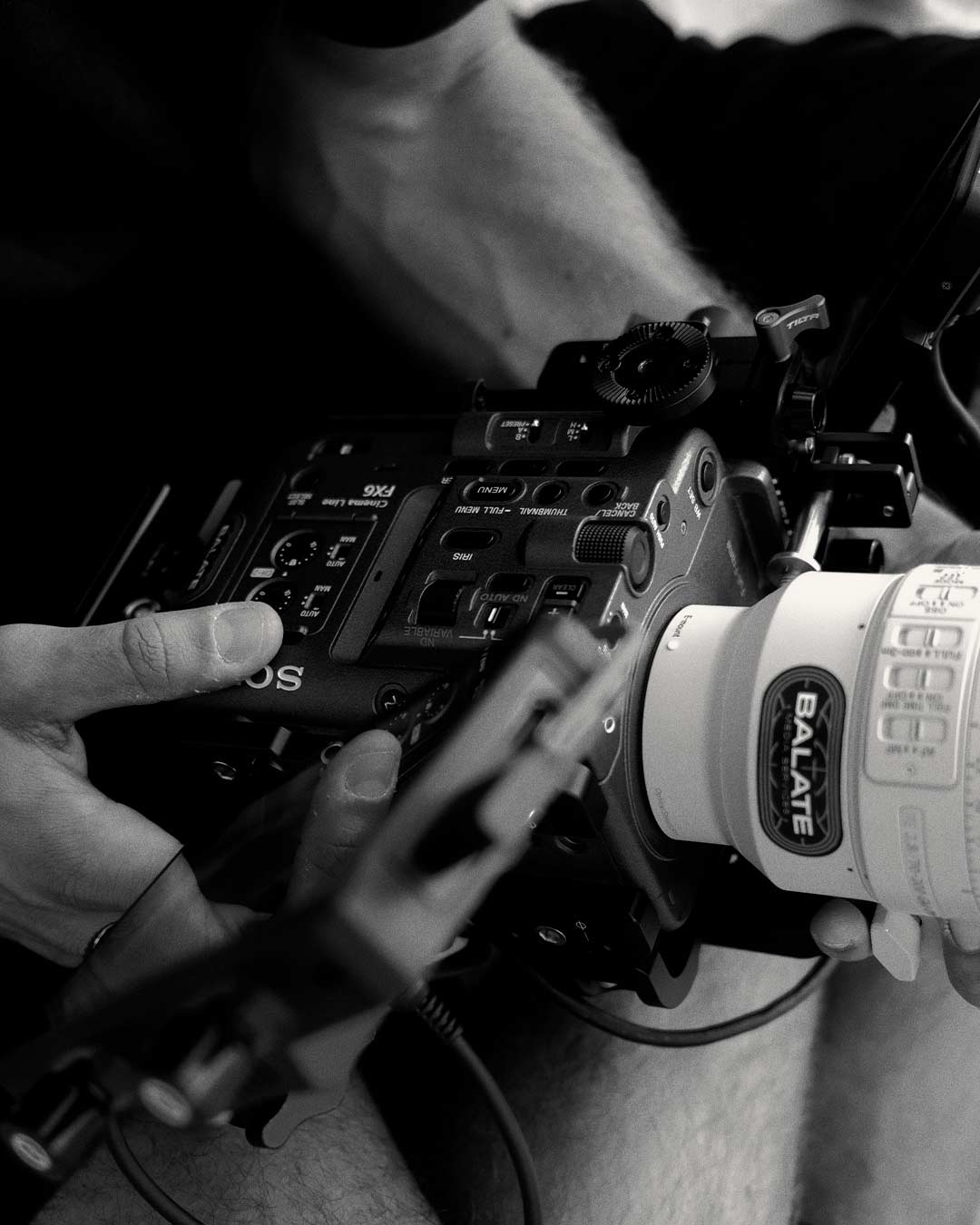
We mapped his strengths against the market. While most production companies lean into chaos and creative spontaneity, Pola invests in technical rigor, planning, timing, resources, to guarantee the outcome before the shoot begins. That discipline became the differentiator. Balate stands for control and technical excellence, with soul. Not different for the sake of it. Just always on target.
The identity
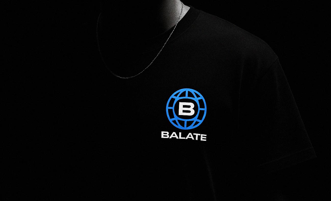
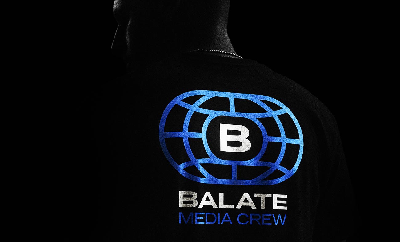
The visual world draws from precision sports, archery, relay races, disciplines where every prior decision converges into one decisive moment. A logo that merges a media balloon with a track and target form. A monochrome, monospaced system built for clarity and impact. Everything signals control without coldness, structure without rigidity.
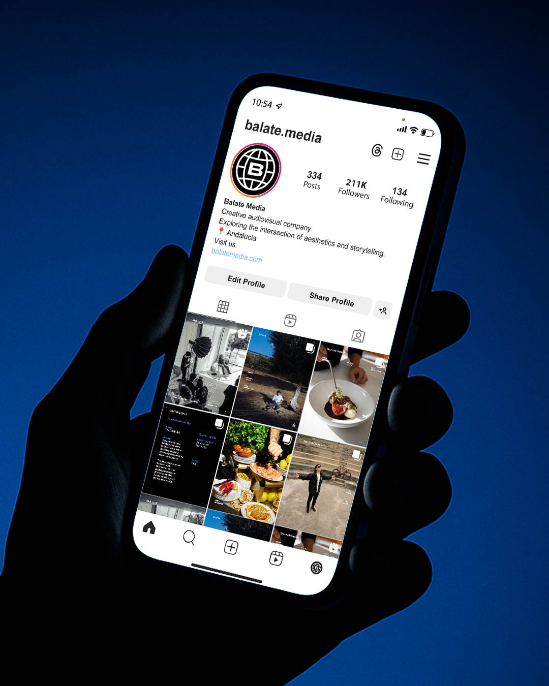
The website and social platforms follow the same principle: let the work lead. Projects are presented with just the essentials, depth available on demand. Social motion graphics draw attention without competing with the footage. A Journal section of travel shots, experiments, and between-shoot moments grounds the visual world and keeps the eye sharp.
The result
Since launch, Balate runs as a fully self-sufficient brand. Quoting, posting, presenting, all systematised, all on-brand. New clients followed, particularly in hospitality. The feedback has been consistent: professional, solid, trustworthy. And for Pola, the structure didn’t constrain him. It gave him room to focus on the craft.
Challenge
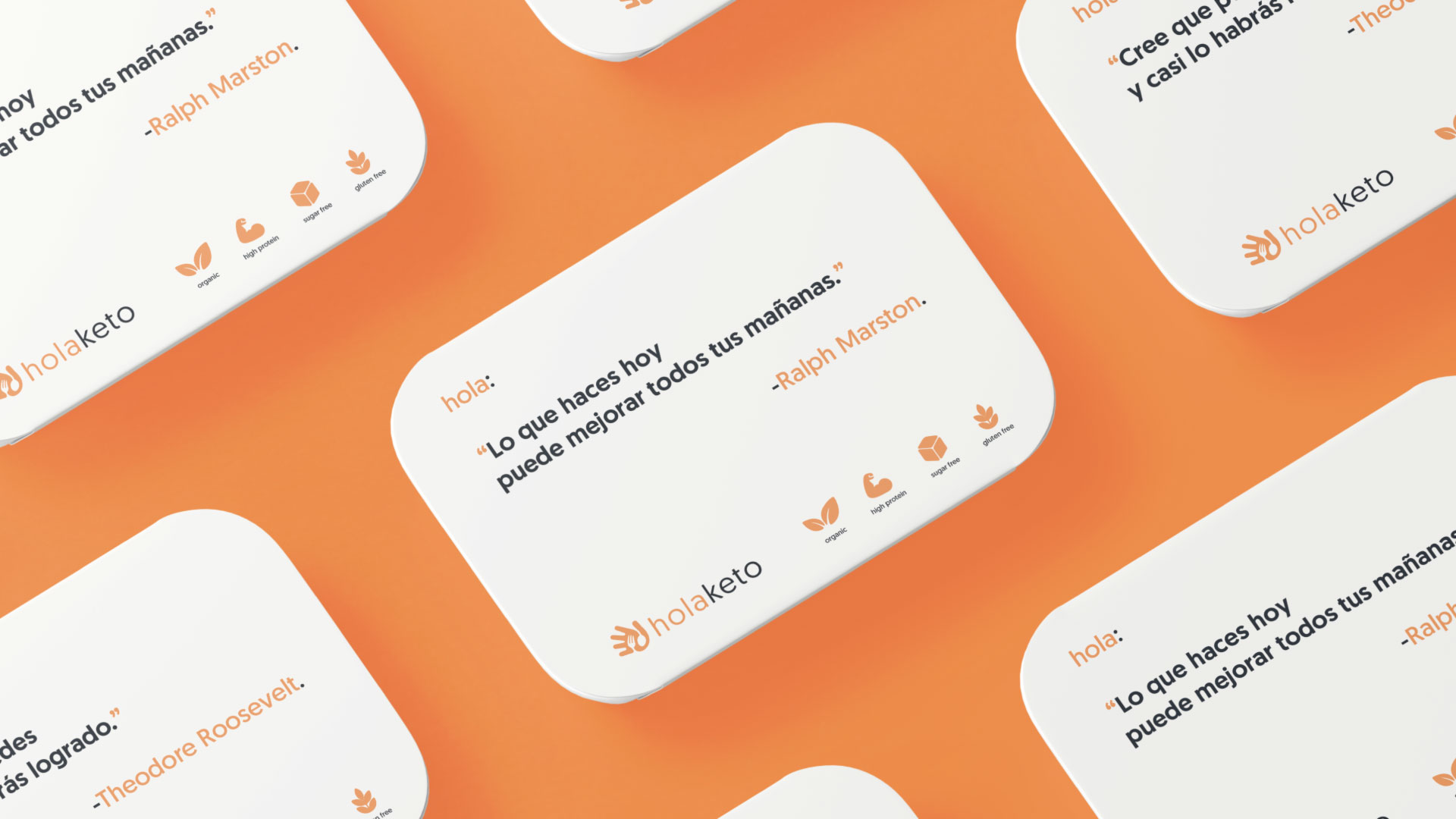
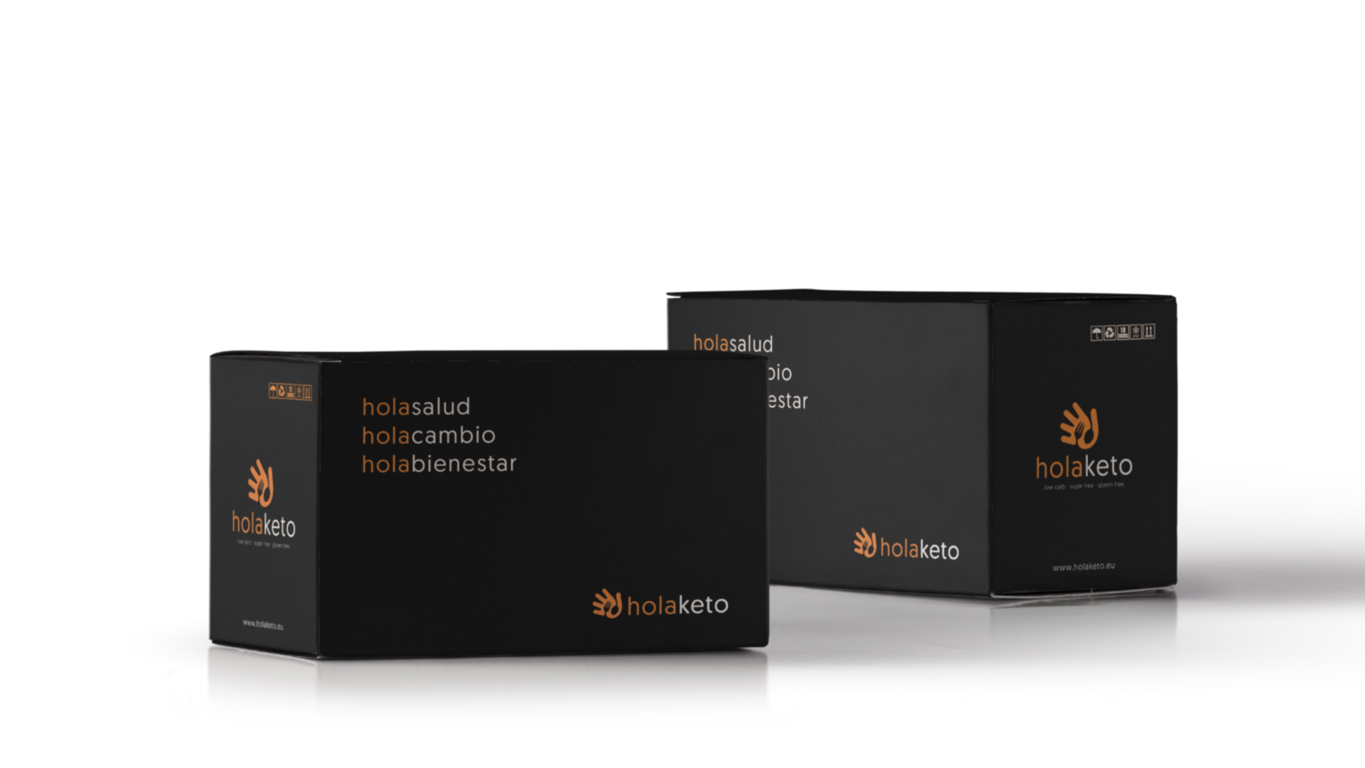
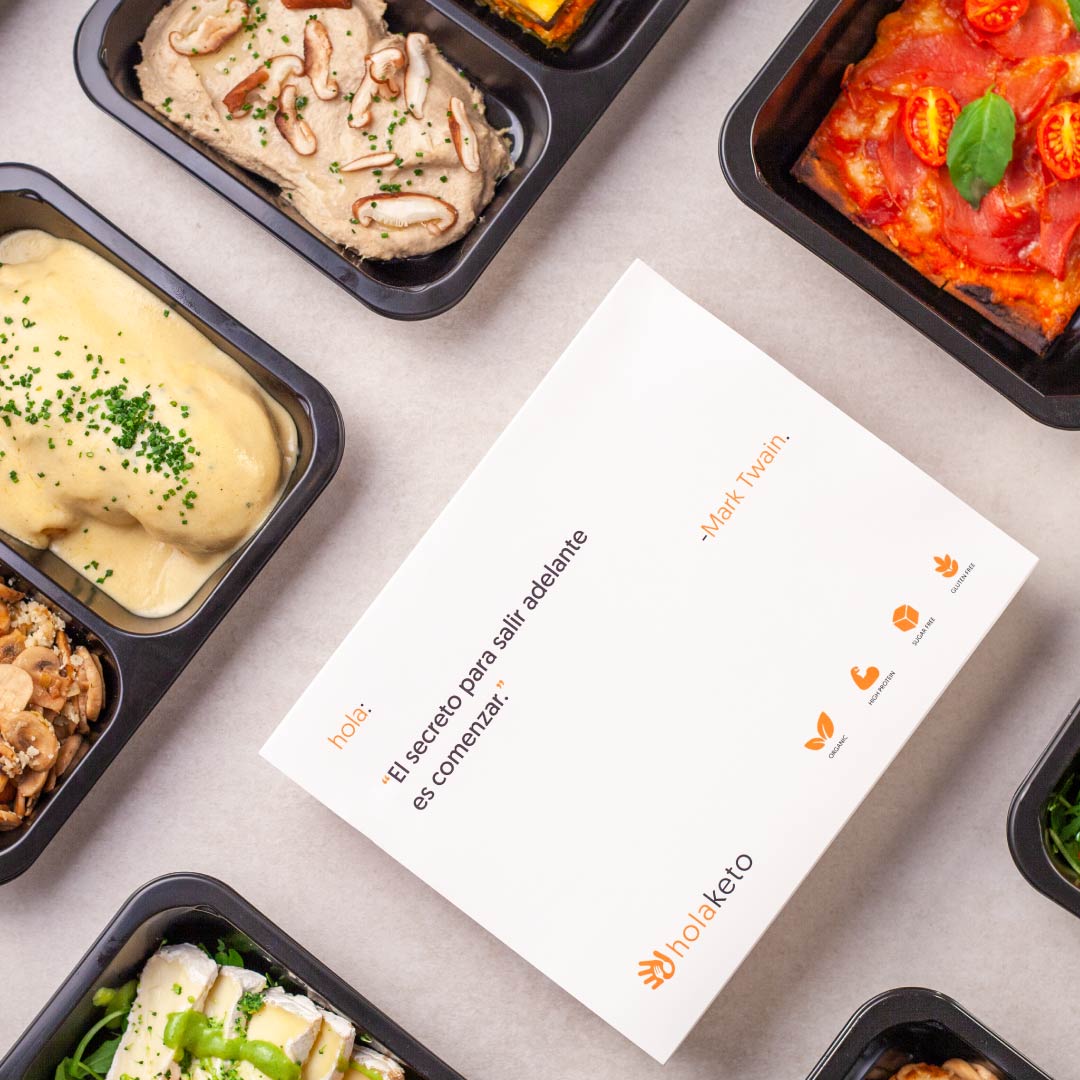
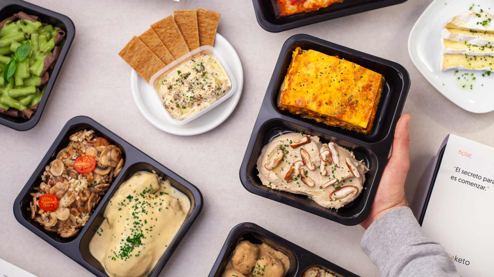
The healthy lifestyle space is full of brands that feel either too strict, too bland or too similar. Holaketo had a clear service, personalised keto meals delivered at home, but needed a brand world that made starting feel easy, not intimidating. The challenge was to create a concept, narrative, identity and packaging system for people who want to improve their lifestyle without feeling pushed, judged or overwhelmed.
Strategy
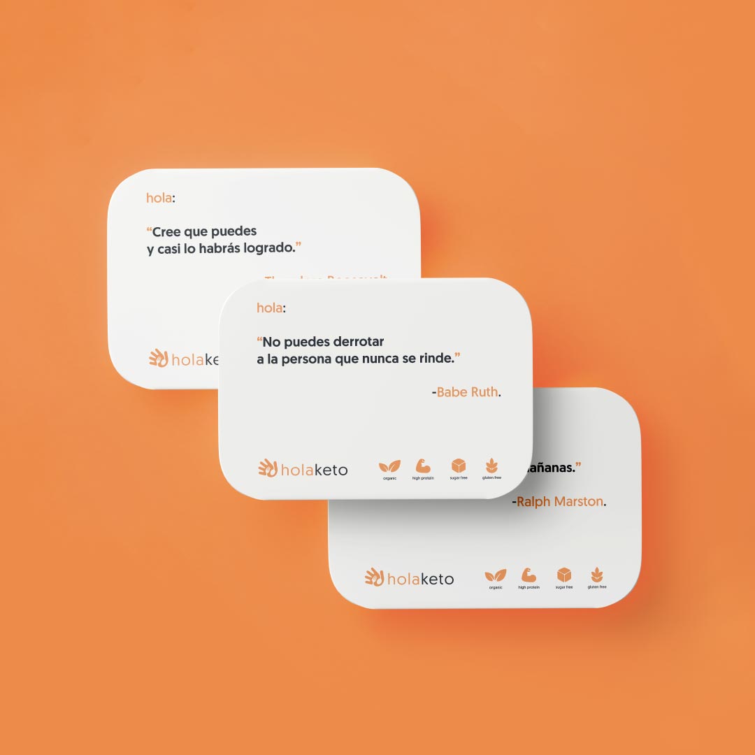
Instead of selling transformation through pressure, discipline or urgency, the brand celebrates the decision to begin. The strategy was built around comfort, confidence and approachability, making keto feel less like a restrictive diet and more like a simple, flexible way to move towards a healthier routine.
Identity
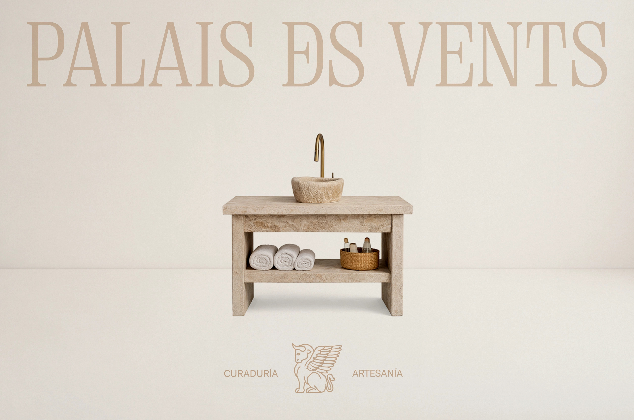
The identity is rooted in ancestral minimalism. Clean compositions, warm neutrals, firm typography and subtle ornamental details create a world that feels ancient but not nostalgic, elegant but not decorative. At its center, the winged beast acts as a guardian figure: strong, calm and protective, embodying the brand’s role as a guide between craft, story and space.
Outcome
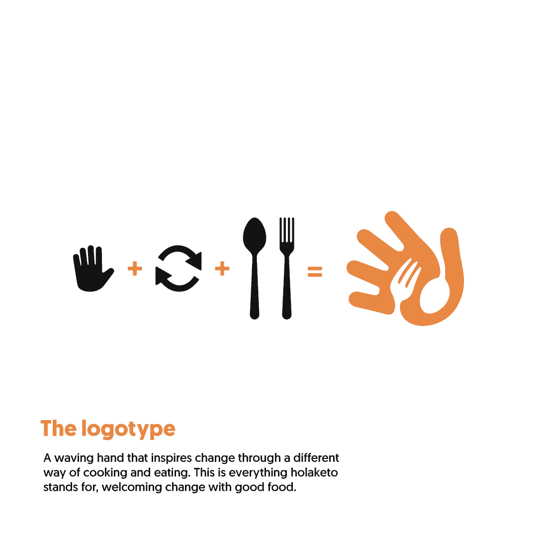
The result is a complete brand identity for a keto food delivery service that feels different from the usual healthy lifestyle category. Holaketo turns the first step into something less stressful and more desirable, giving people a friendly ticket into self-improvement through food that adapts to their routine.
Challenge
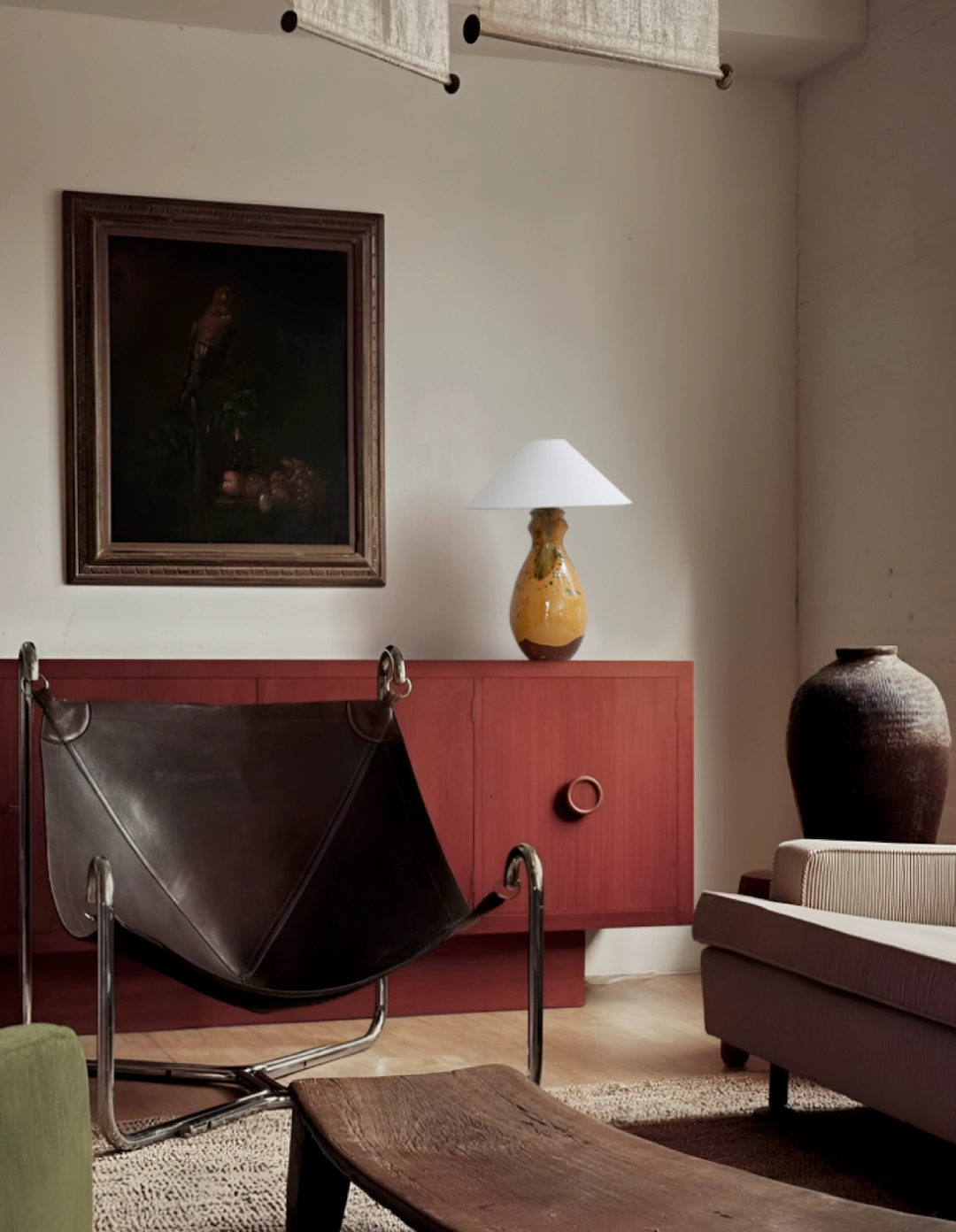
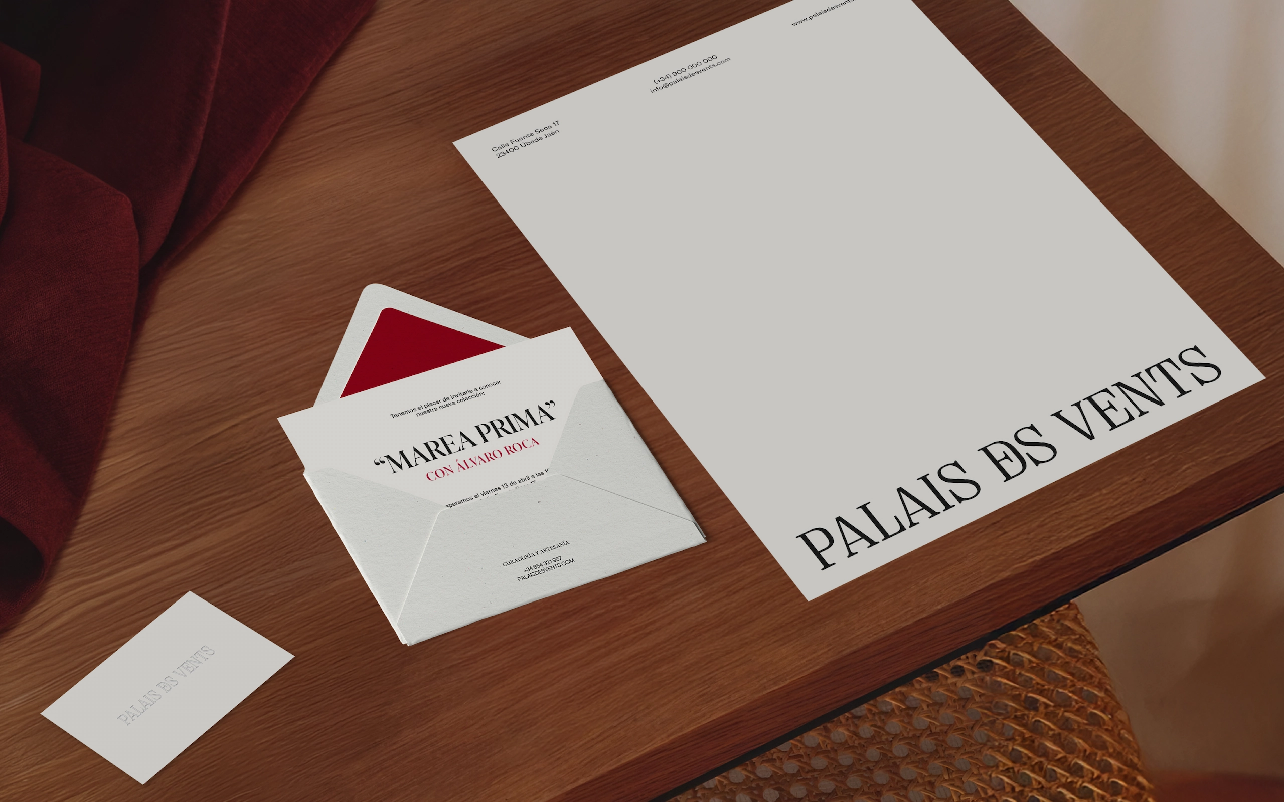
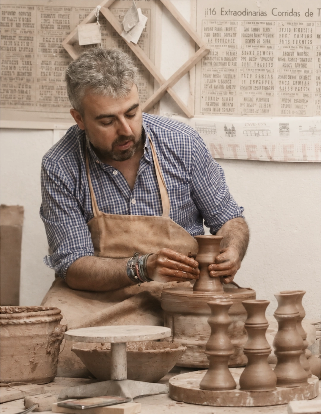
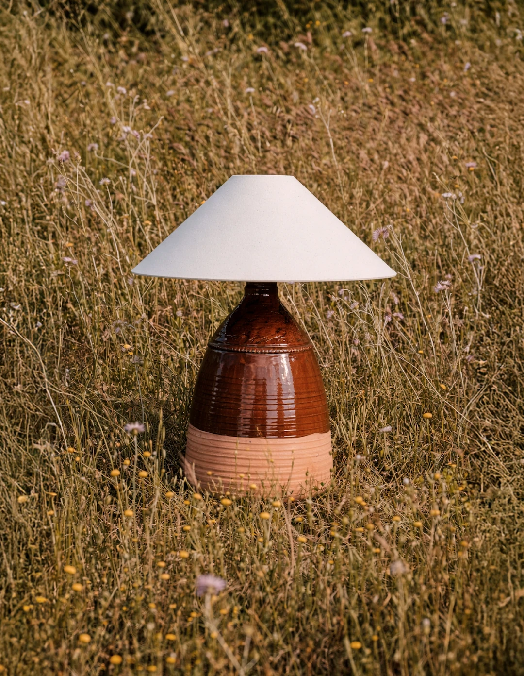
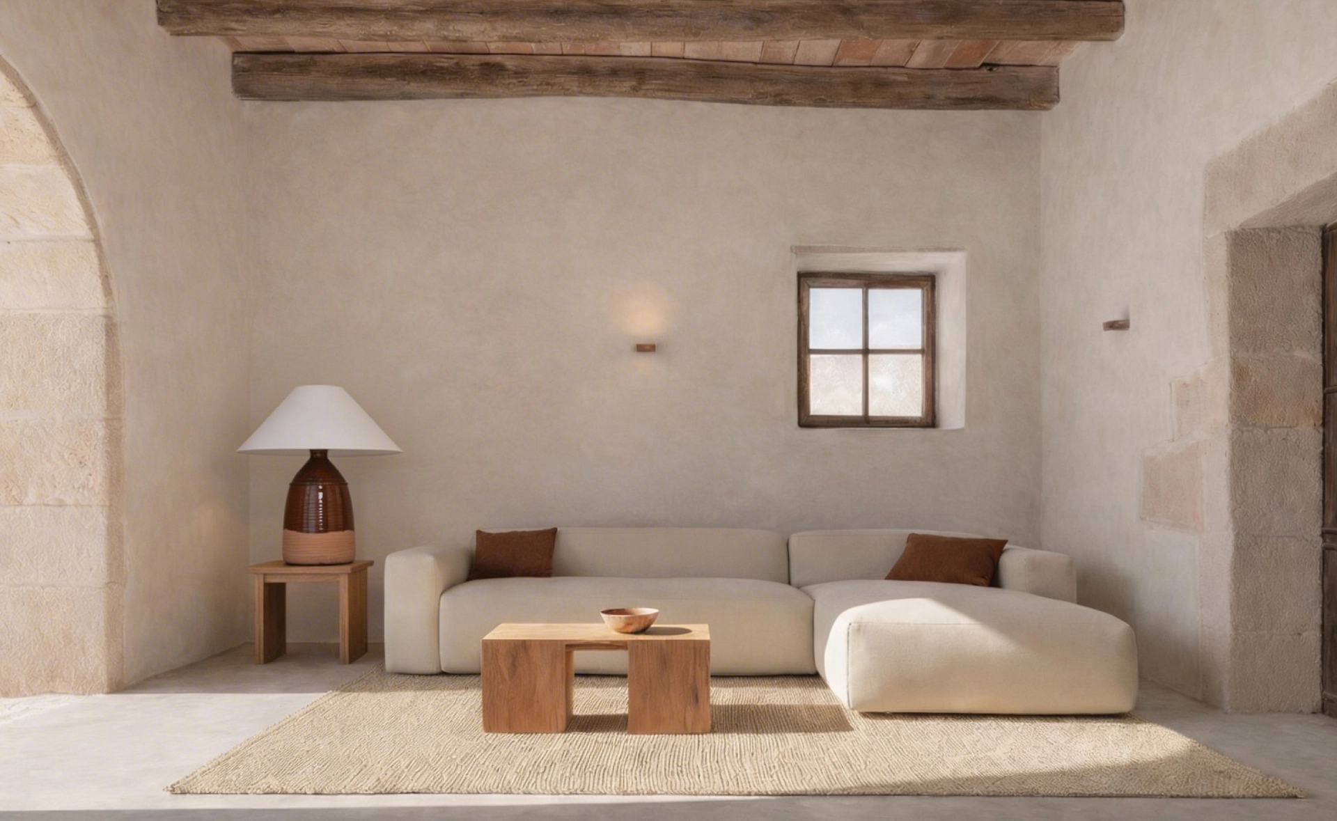
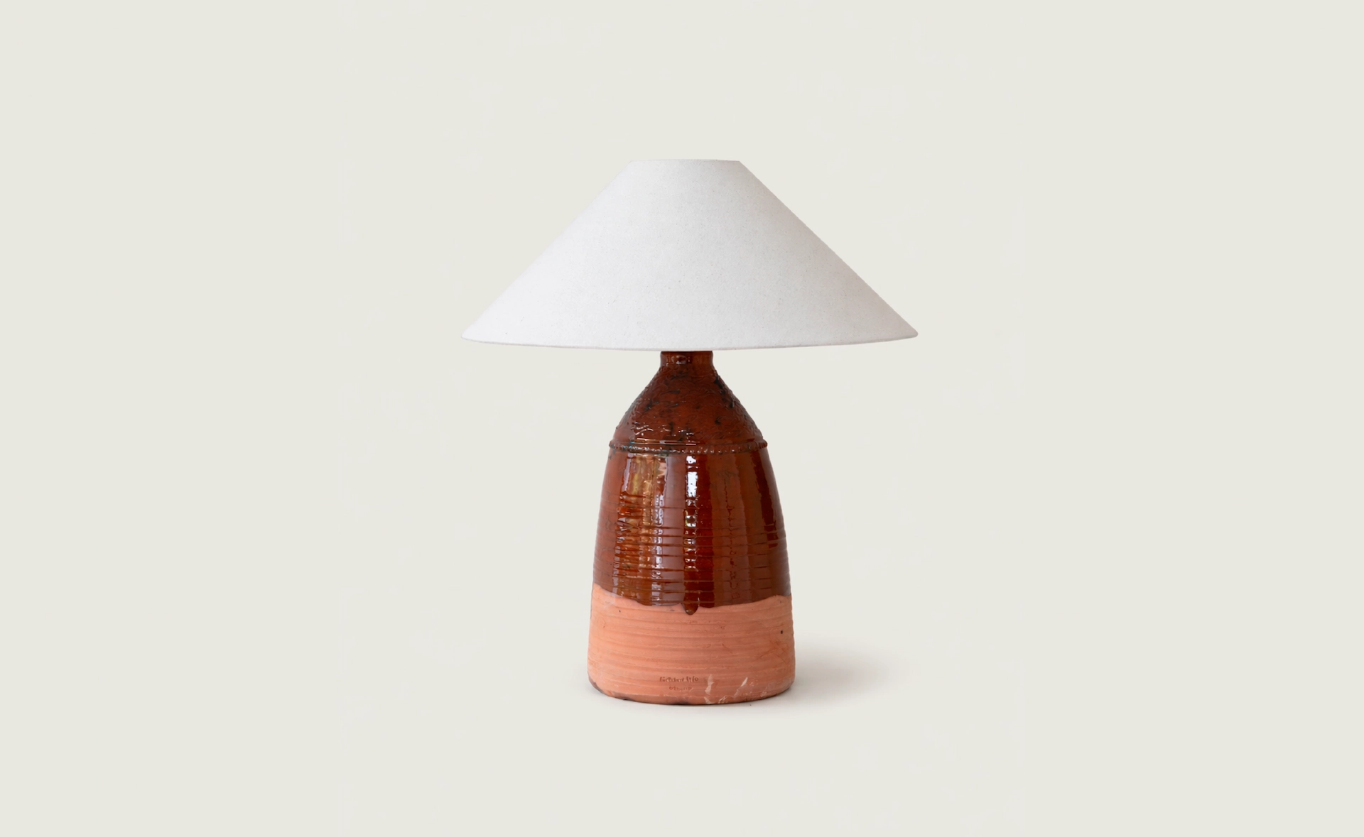
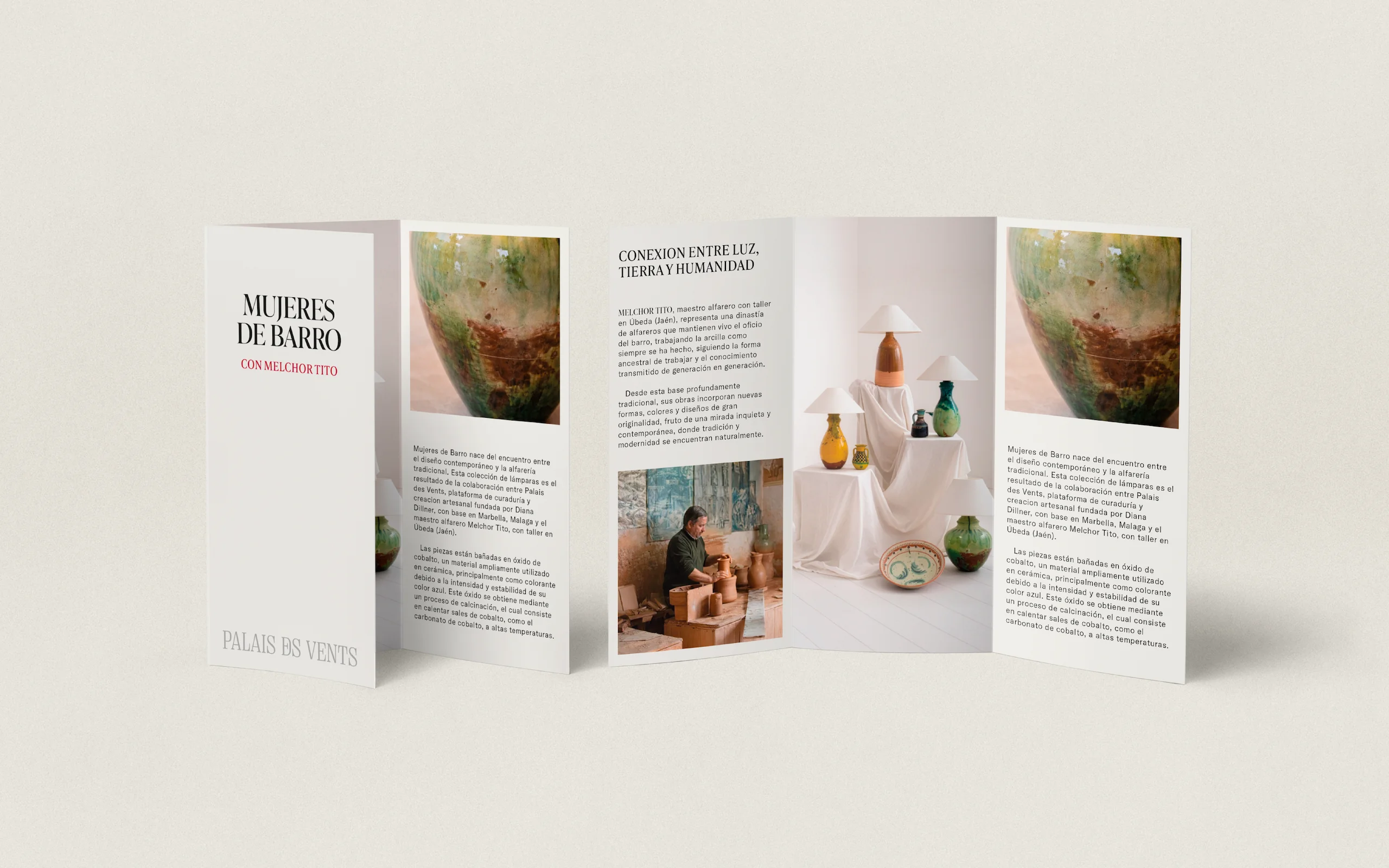
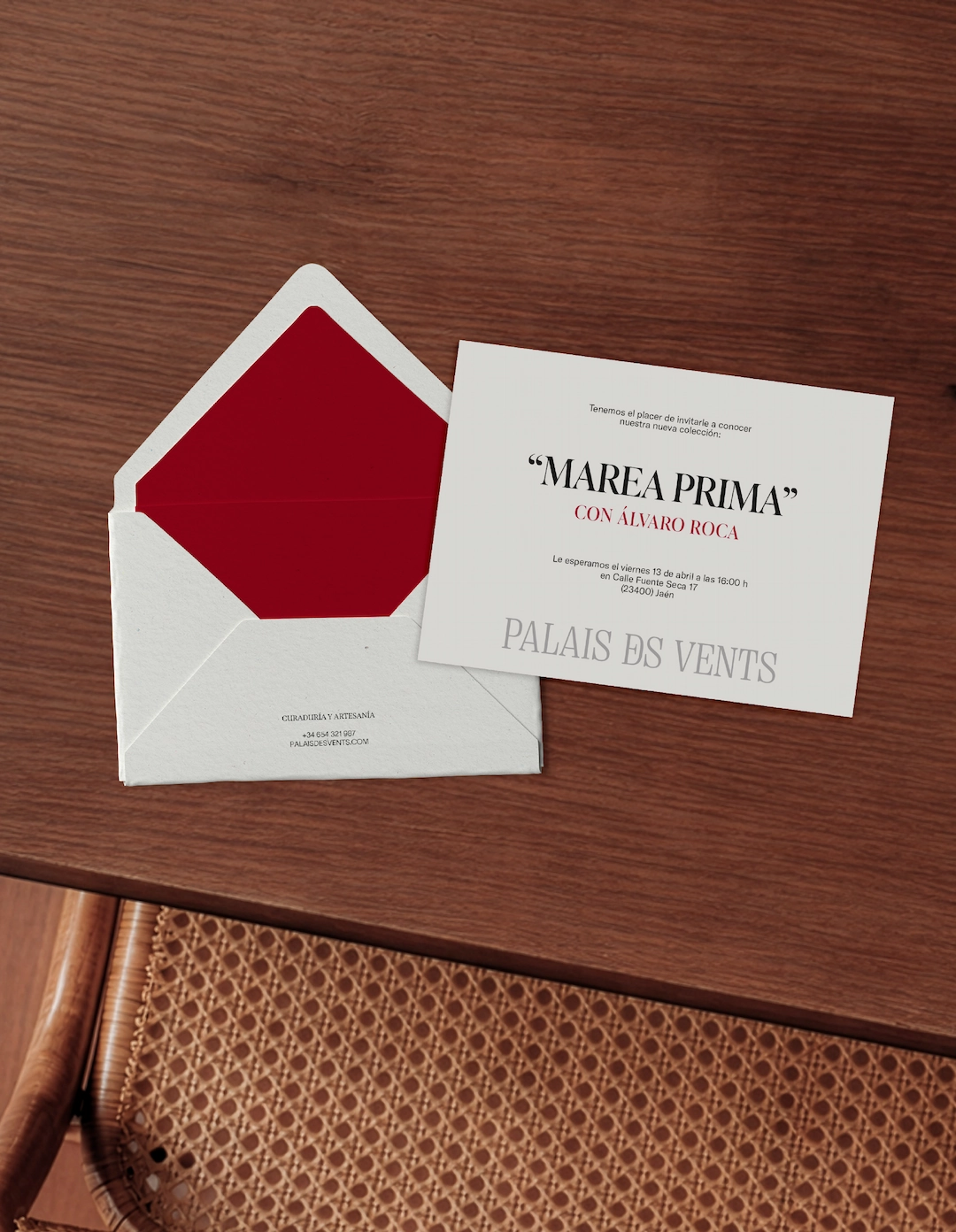
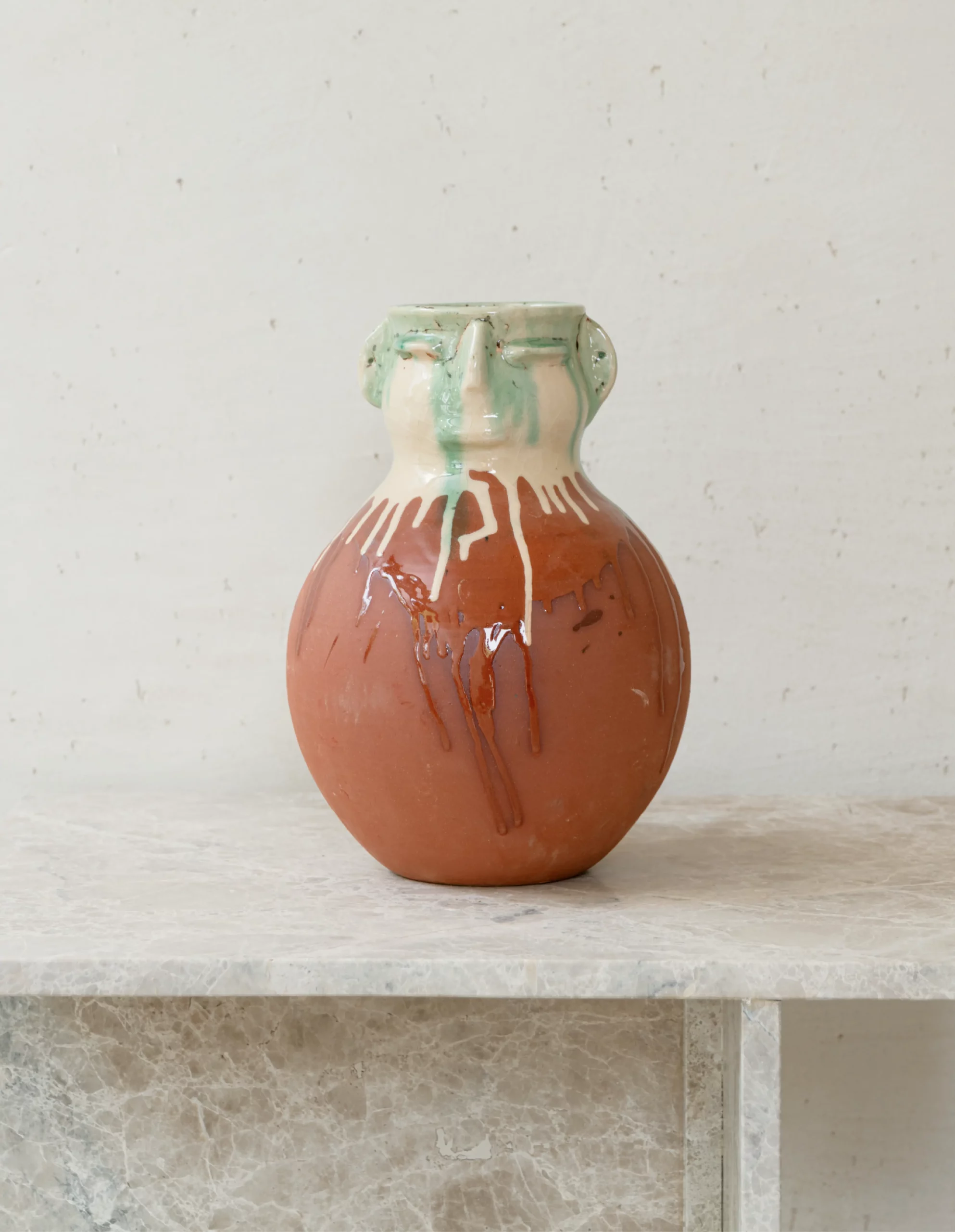
Palais des Vents was born from a delicate ambition: to create decorative objects and handcrafted furniture with the presence of art, without becoming distant, ornamental or overly precious. The challenge was to shape a brand capable of connecting two worlds, the deep creativity of the artisan and the refined eye of the interior designer, while giving each piece enough meaning, character and value to transform the spaces it inhabits.
Strategy
We built the brand around the idea of connection. Palais des Vents bridges the artisan’s creative depth with the interior designer’s sense of place, transforming handcrafted pieces into objects of atmosphere and character. The strategic direction moved away from obvious luxury, towards a more silent form of elegance: careful, honest and deeply material.
Identity
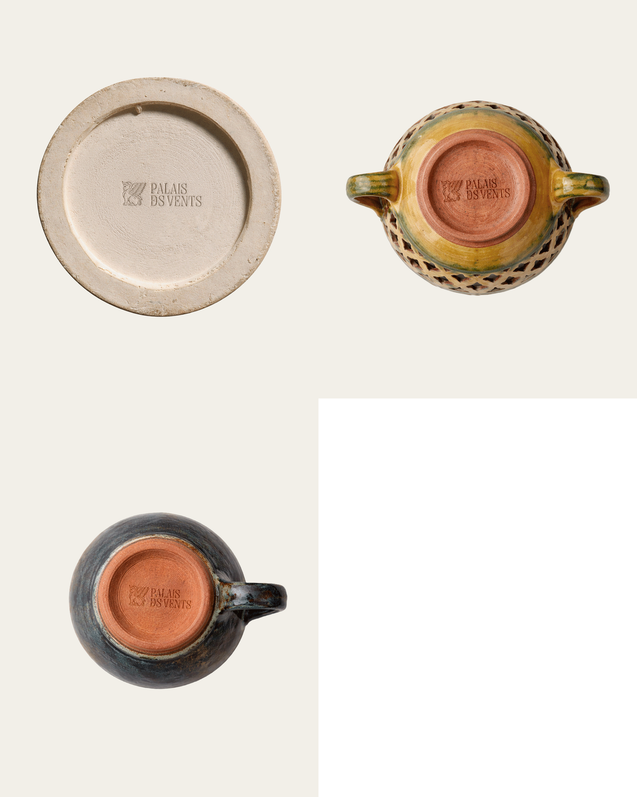
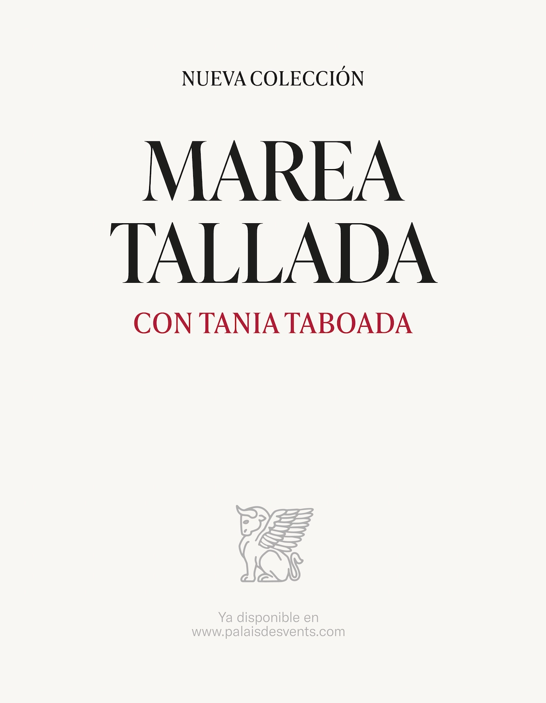
The identity is rooted in ancestral minimalism. Clean compositions, warm neutrals, firm typography and subtle ornamental details create a world that feels ancient but not nostalgic, elegant but not decorative. At its center, the winged beast acts as a guardian figure: strong, calm and protective, embodying the brand’s role as a guide between craft, story and space.
Application
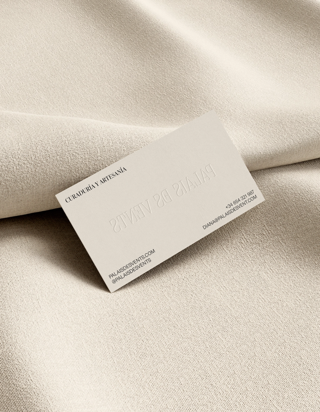
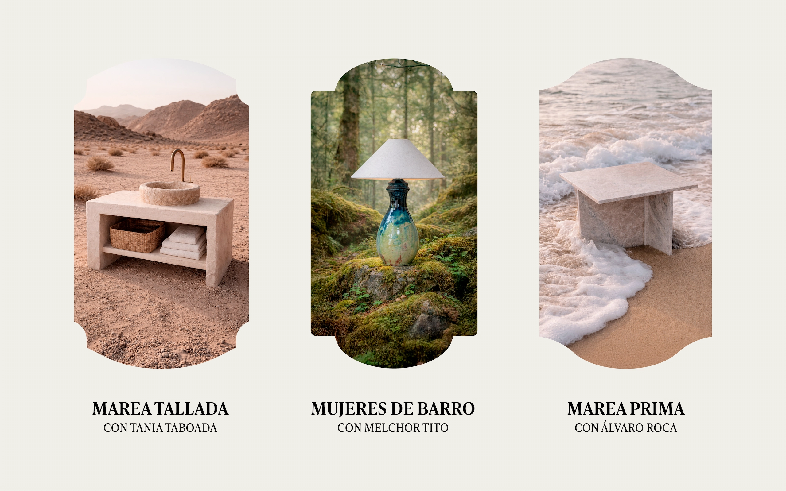
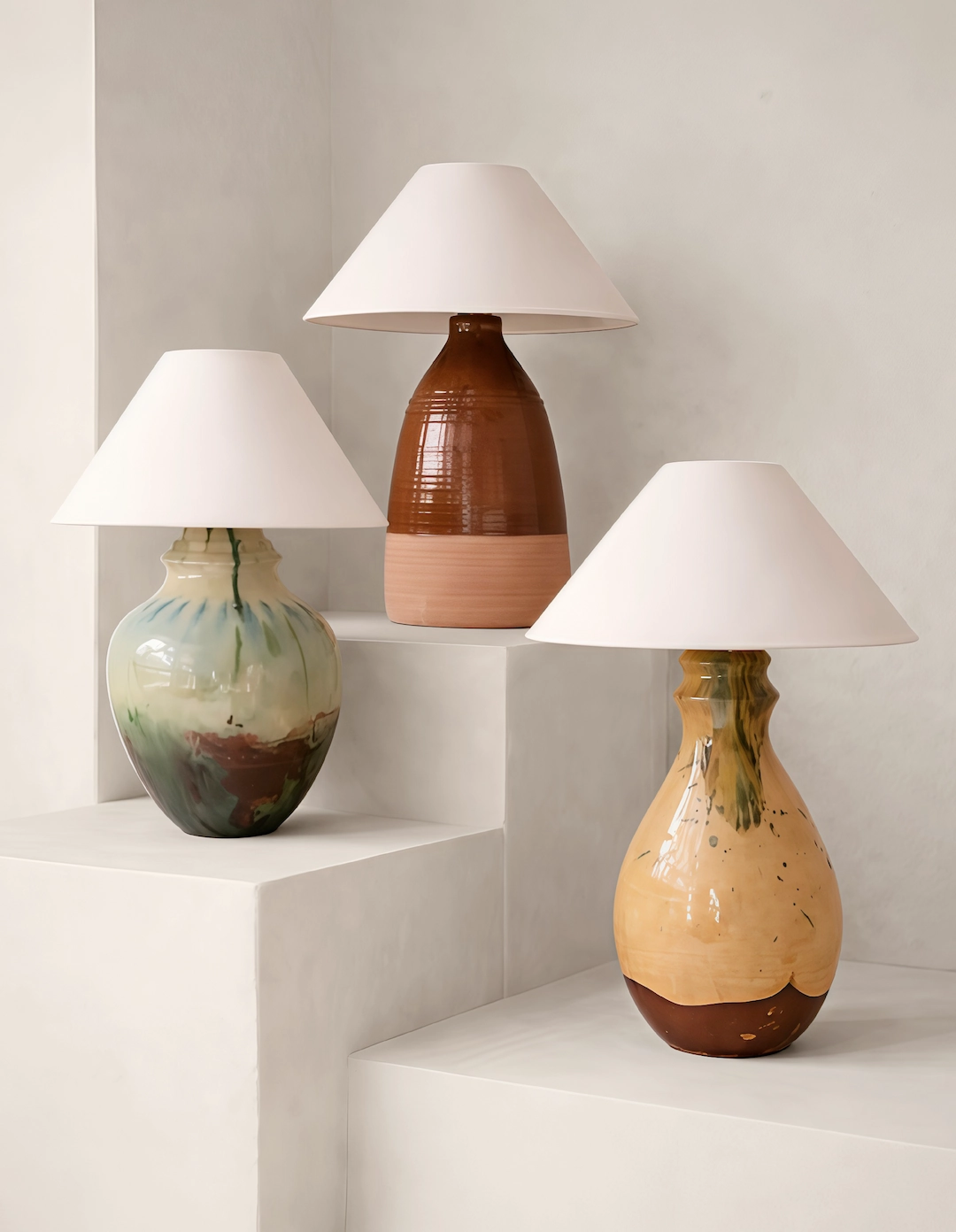
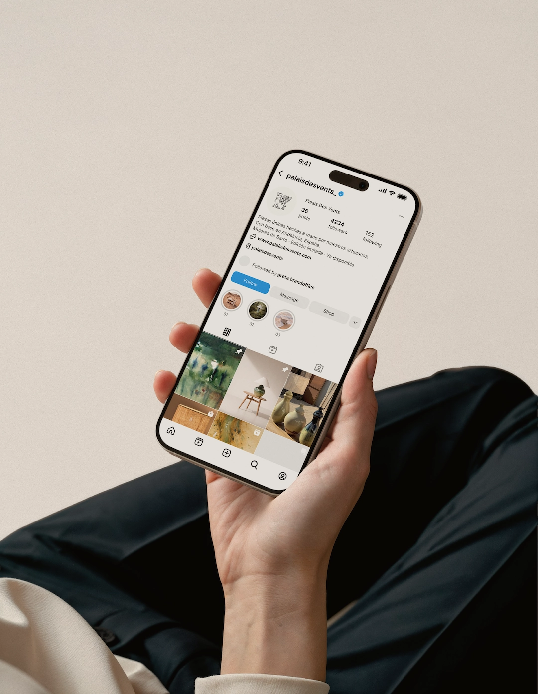
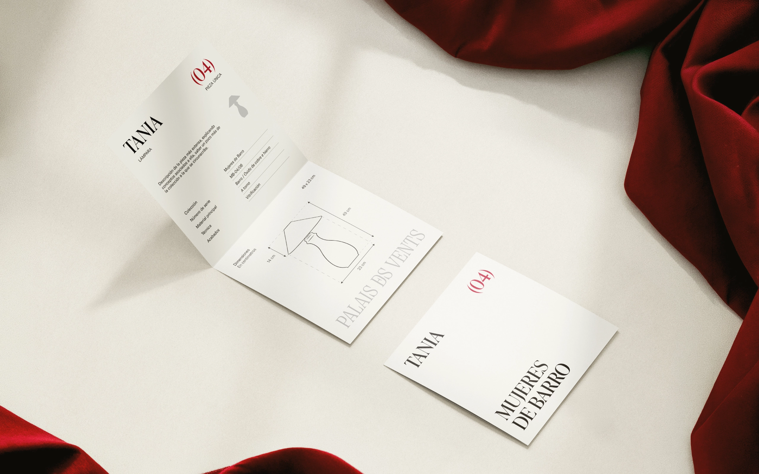
Across the system, every piece is treated as both an object and a portal. Photography places products in context while preserving their sculptural presence. Textures, collection stories and refined layouts add depth without excess. The brand becomes a flexible gallery-like environment, able to present handcrafted objects, furniture and collaborations with the same sense of care.
Outcome
Palais des Vents now appears as a distinctive studio for handcrafted decorative pieces and furniture, with a language strong enough to support future collections, collaborations and European growth. The brand gives its objects a larger world to belong to, one defined by elegance, craft, atmosphere and quiet distinction.
Briefing
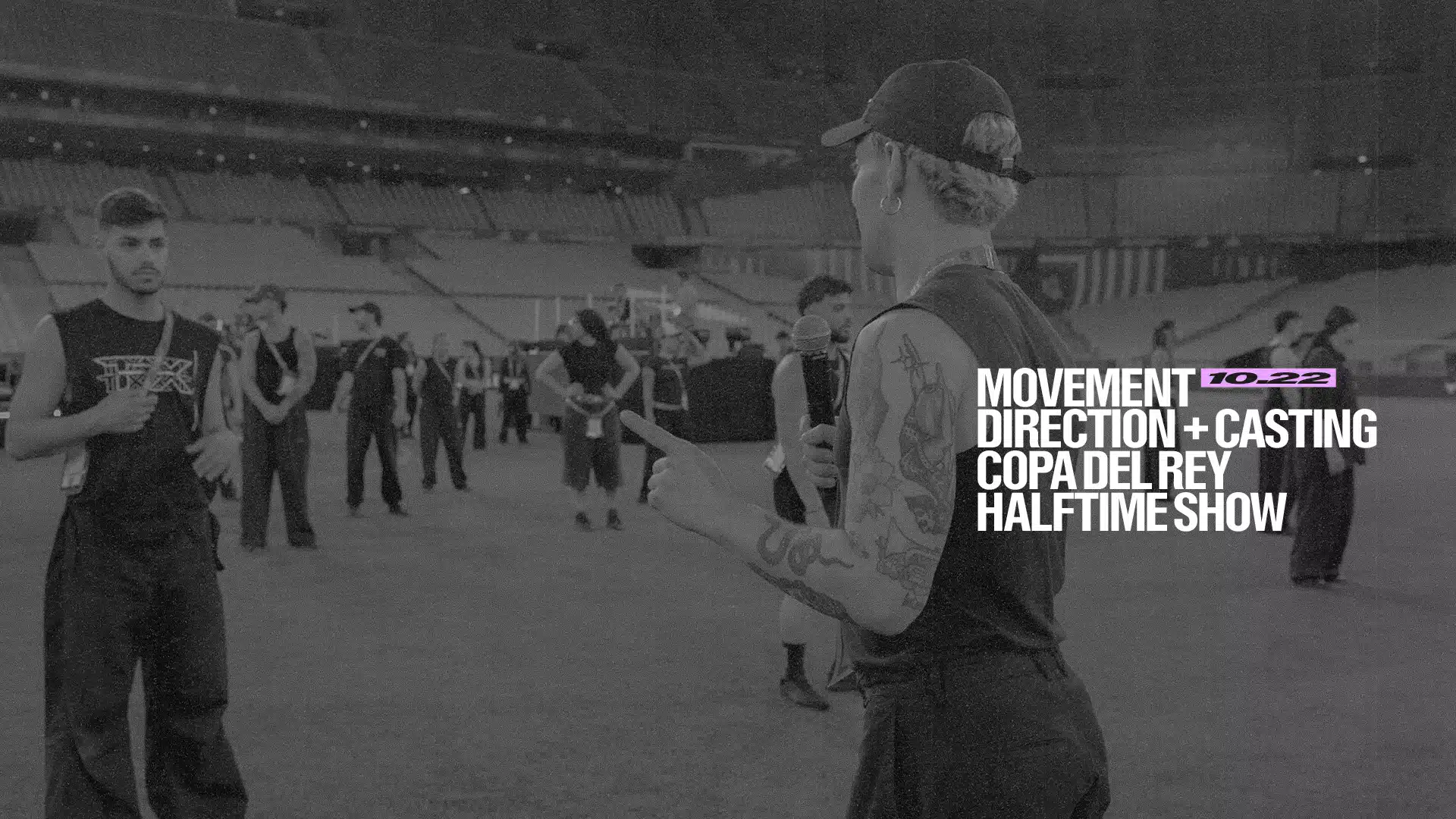
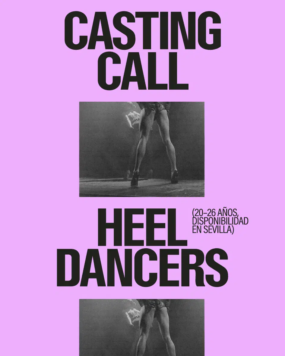
Jesús wanted to create a movement agency that did things differently. From inside the industry, he had witnessed the unfair treatment of dancers, choreographers and the wider team by agencies and production companies, and felt that things had to change. Blackout refers to the blackout between acts: the moment when change takes place.
Brand Strategy
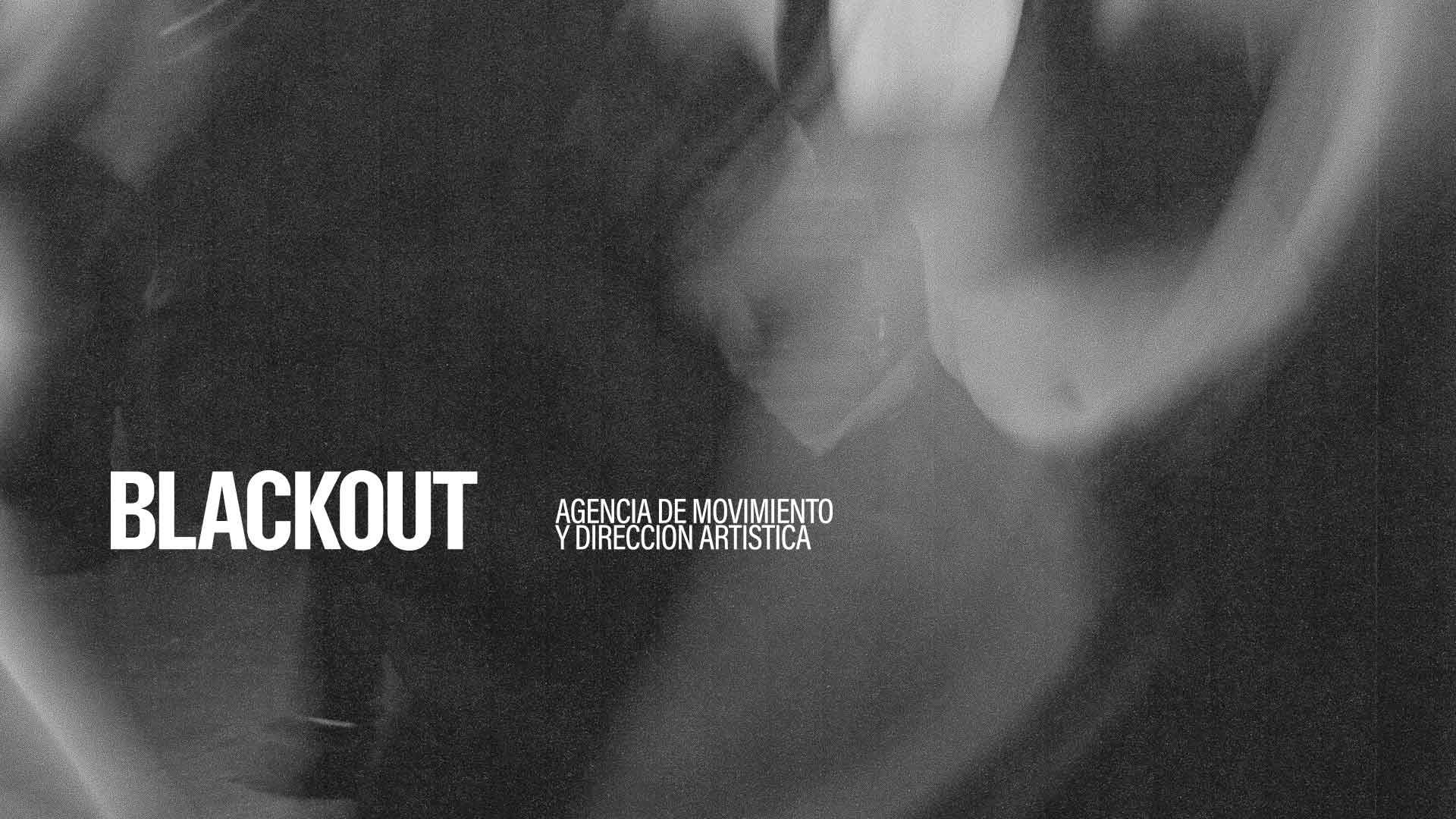
Our starting point was the concept of a stage blackout. From within that darkness, the team moves, transforms and creates a new stage.
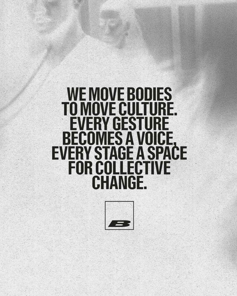
Blackout embraces the idea of “Show, don’t tell” as a way to drive change. Talking is not enough; you also have to act. Copy is kept minimal and direct, allowing the work to speak for itself through photography and film.
The Identity
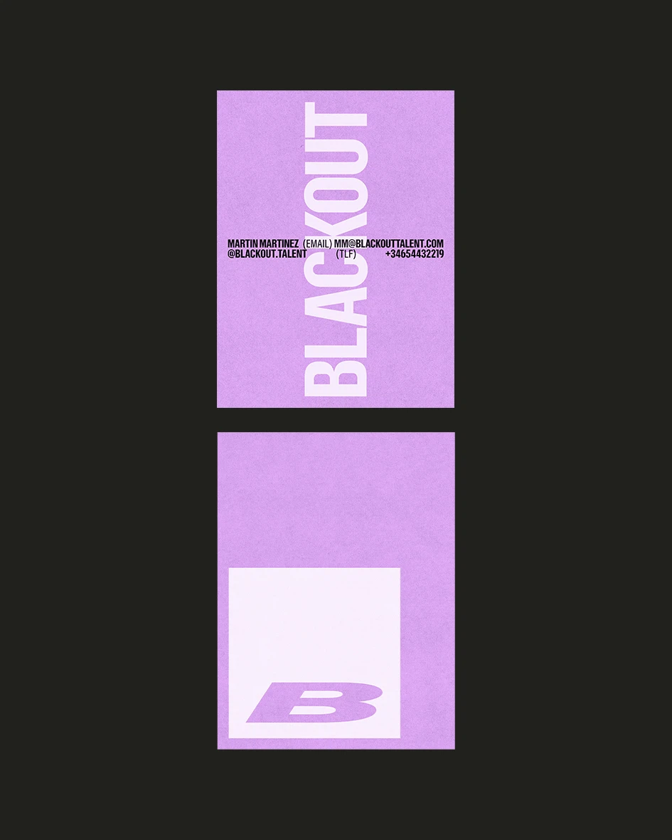
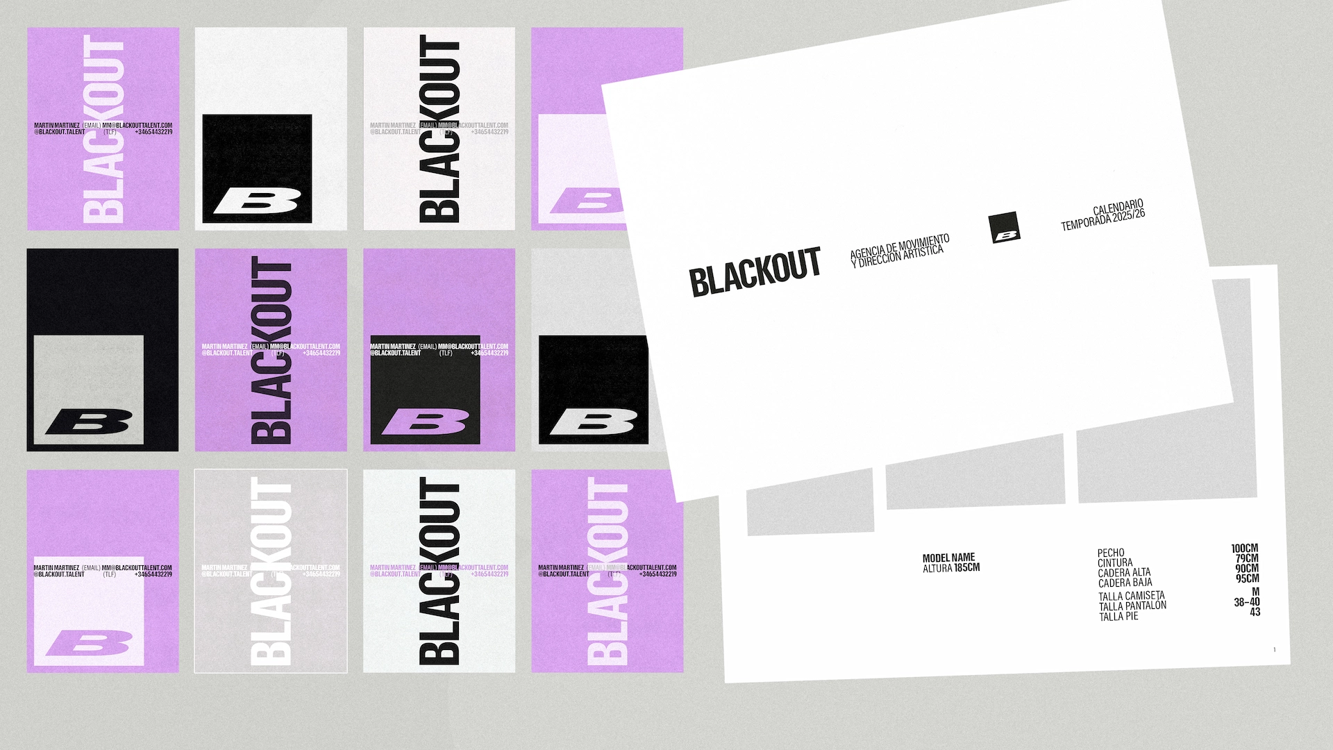

We use a soft black paired with grey, white and lilac. Grey on black reduces the contrast, heightening the sense of darkness and elegance, while lilac breaks up the palette, adding softness and warmth.
The typefaces are Resial Condensed and Acumin in a range of styles. Resial is solid, modern and solemn, while Acumin’s variety of weights and styles allows us to create movement through different widths and angles.
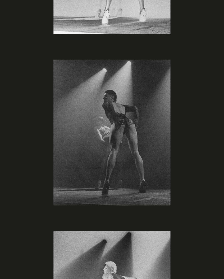
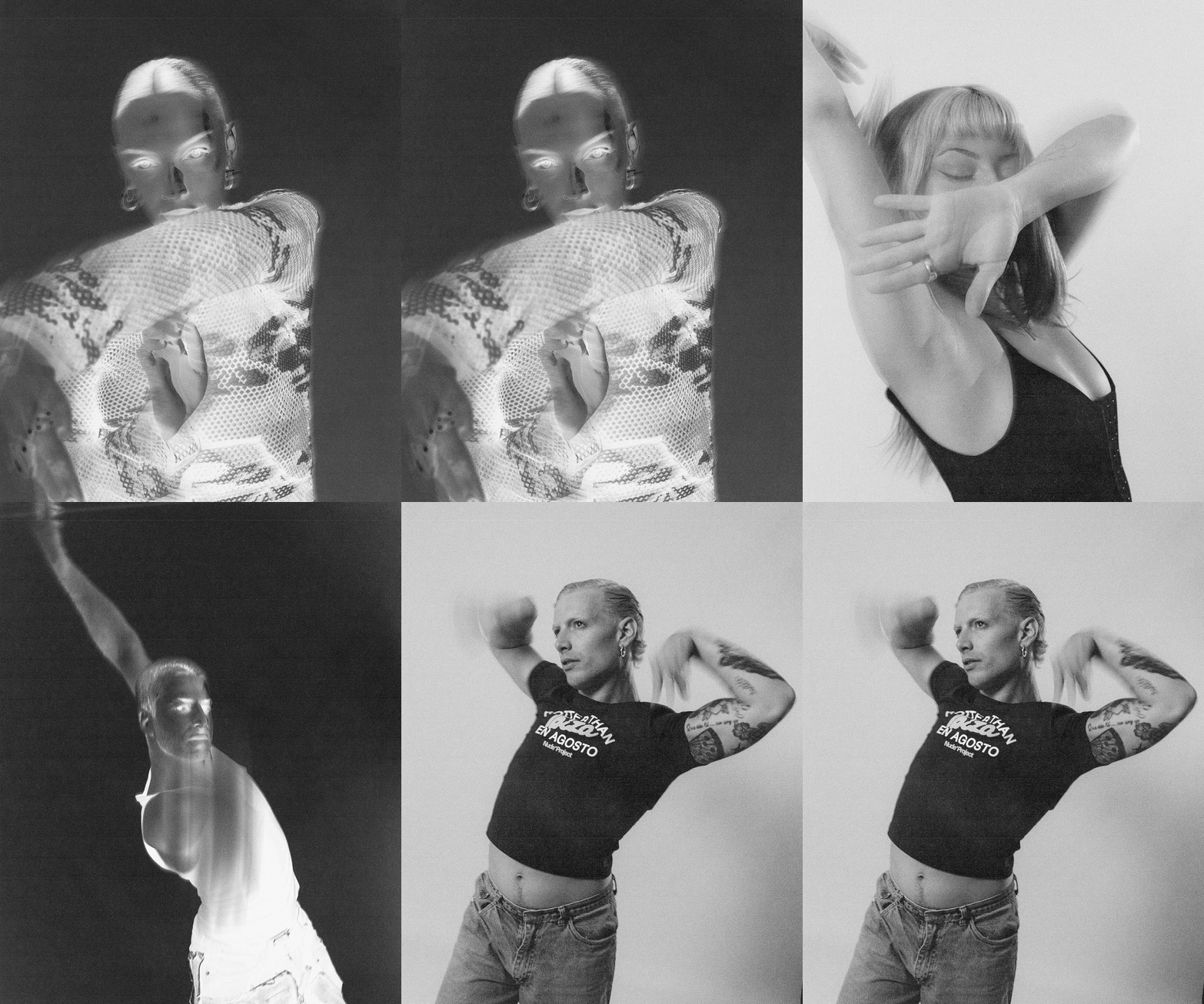
The photographic treatment is key: textured, low-contrast black and white, with negative effects that reveal what lies hidden and invite us to see things differently.
The Result
A brand that allows the team’s full talent to shine, providing a foundation for film and photography featuring its roster of dancers and directors.
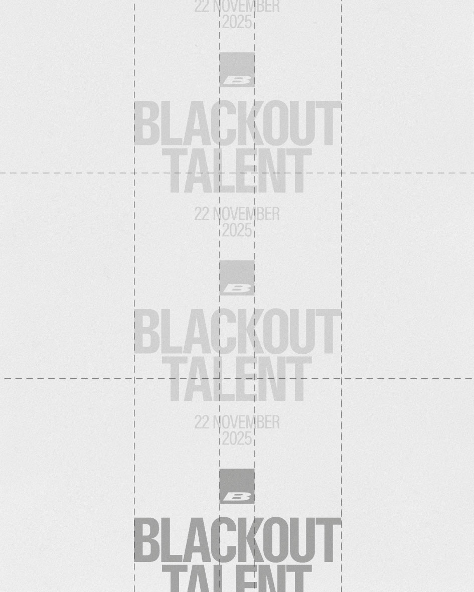
The identity reinforces the idea of blackout, creating intrigue while conveying care and confidence. Its uncompromising minimalism, inspired by activist fanzines, provides the framework for a movement seeking to change the status quo—not only through resistance, but by leading by example.