Here to change the movement industry, creating unforgettable projects through fair and professional relationships.
Briefing
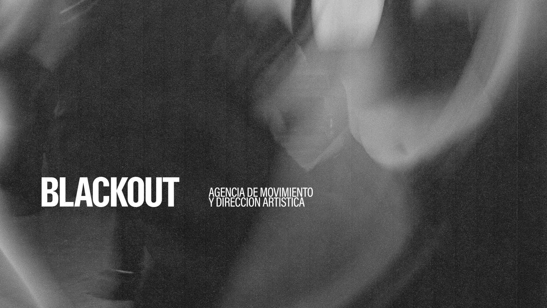
Jesús wanted to create a movement agency that did things differently. From inside the industry, he had witnessed the unfair treatment of dancers, choreographers and the wider team by agencies and production companies, and felt that things had to change. Blackout refers to the blackout between acts: the moment when change takes place.


Brand Strategy
Our starting point was the concept of a stage blackout. From within that darkness, the team moves, transforms and creates a new stage.
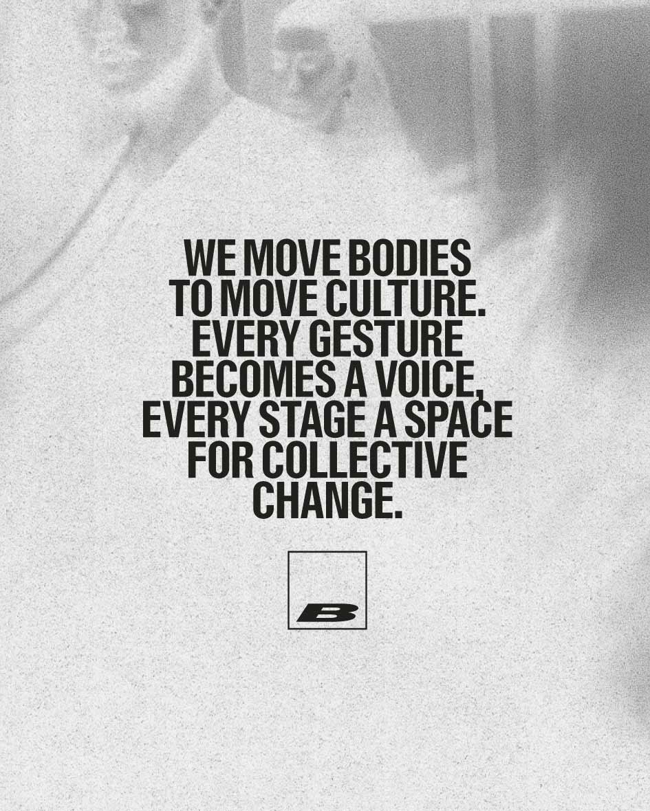
Blackout embraces the idea of “Show, don’t tell” as a way to drive change. Talking is not enough; you also have to act. Copy is kept minimal and direct, allowing the work to speak for itself through photography and film.
The Identity
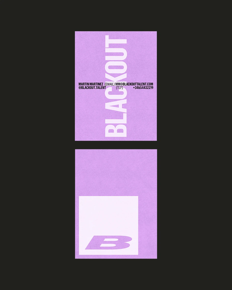
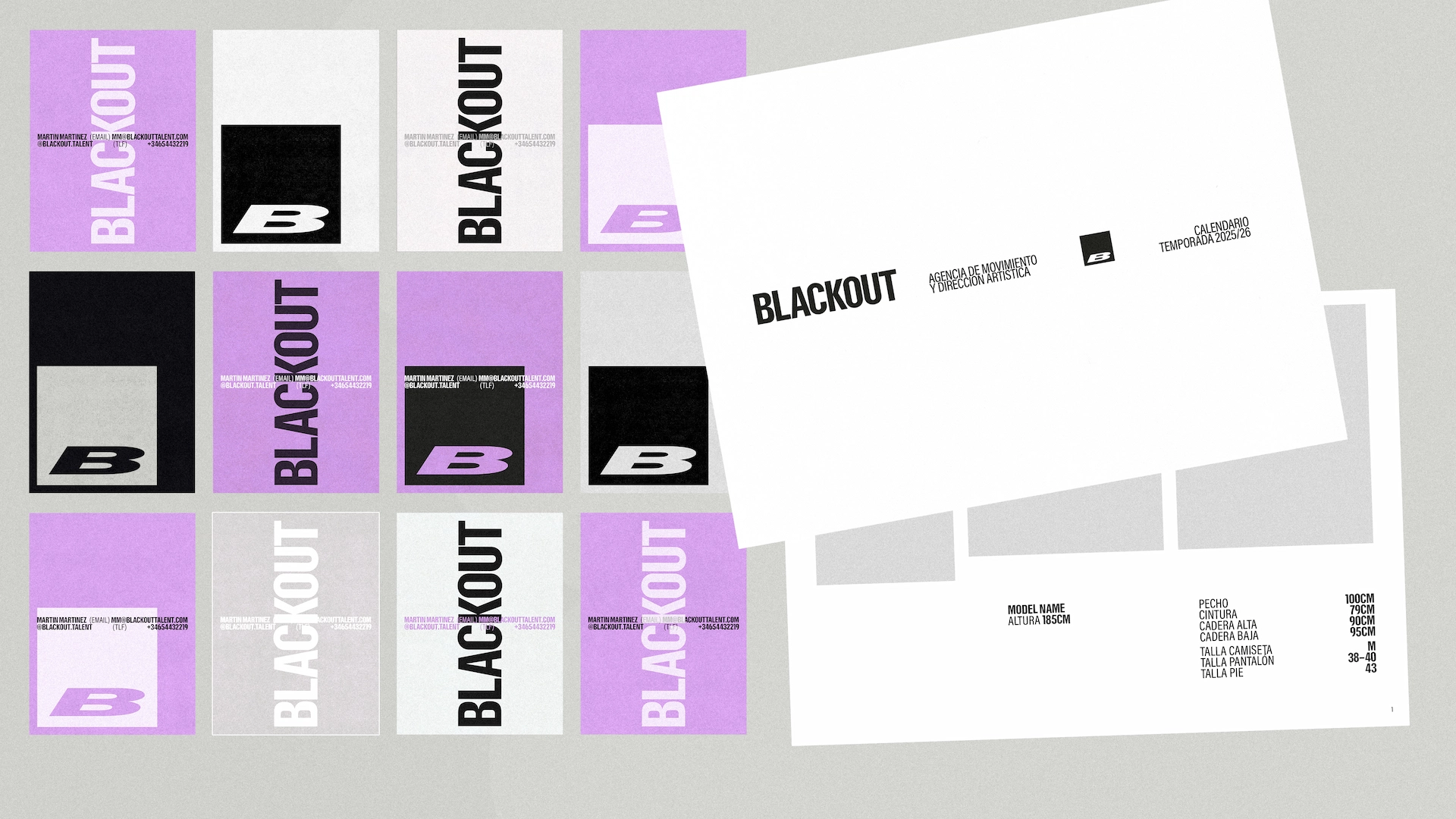

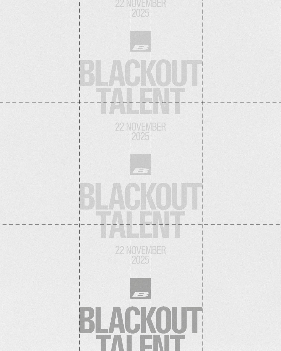
We use a soft black paired with grey, white and lilac. Grey on black reduces the contrast, heightening the sense of darkness and elegance, while lilac breaks up the palette, adding softness and warmth.
The typefaces are Resial Condensed and Acumin in a range of styles. Resial is solid, modern and solemn, while Acumin’s variety of weights and styles allows us to create movement through different widths and angles.
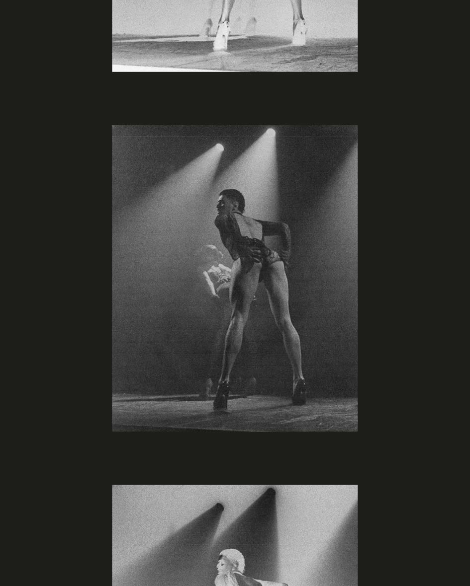
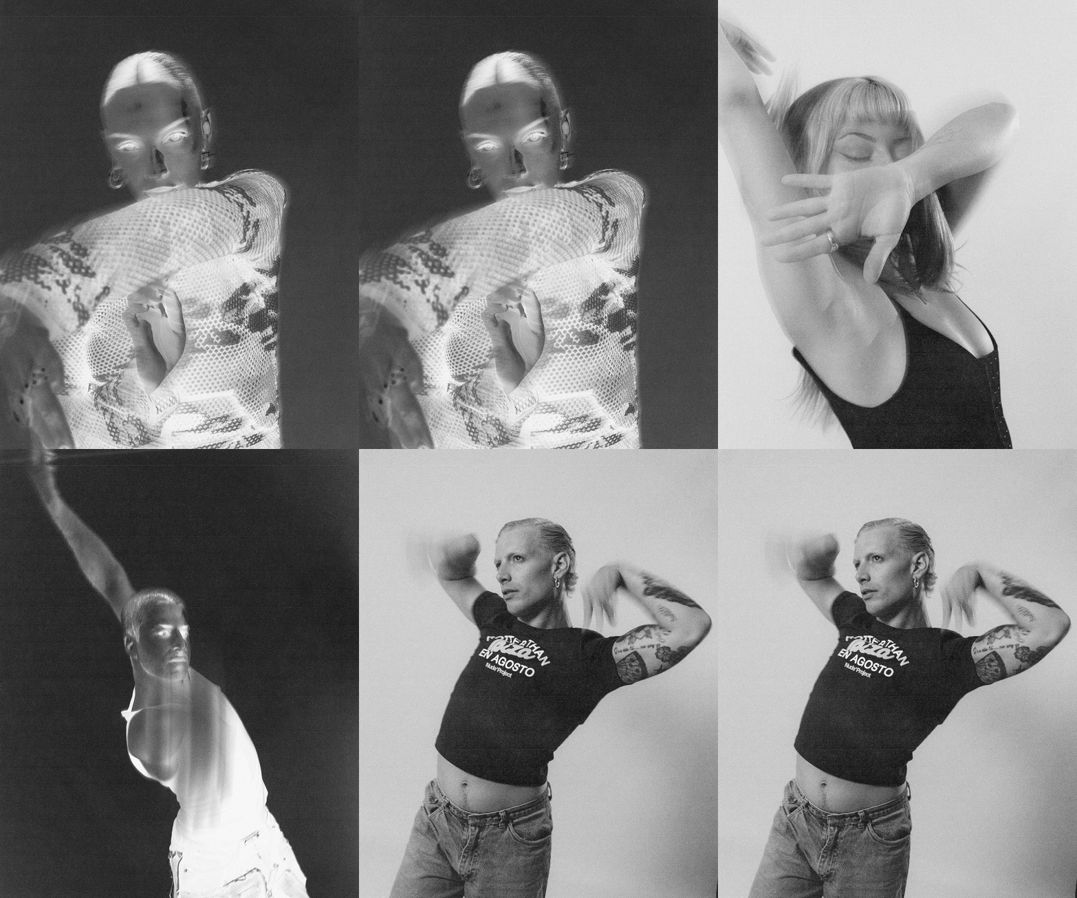
The photographic treatment is key: textured, low-contrast black and white, with negative effects that reveal what lies hidden and invite us to see things differently.
The Result
A brand that allows the team’s full talent to shine, providing a foundation for film and photography featuring its roster of dancers and directors.
The identity reinforces the idea of blackout, creating intrigue while conveying care and confidence. Its uncompromising minimalism, inspired by activist fanzines, provides the framework for a movement seeking to change the status quo—not only through resistance, but by leading by example.
Services
Branding
Team
Brand Strategy - Rodrigo Ramos Graphic Design - Alberto Sánchez