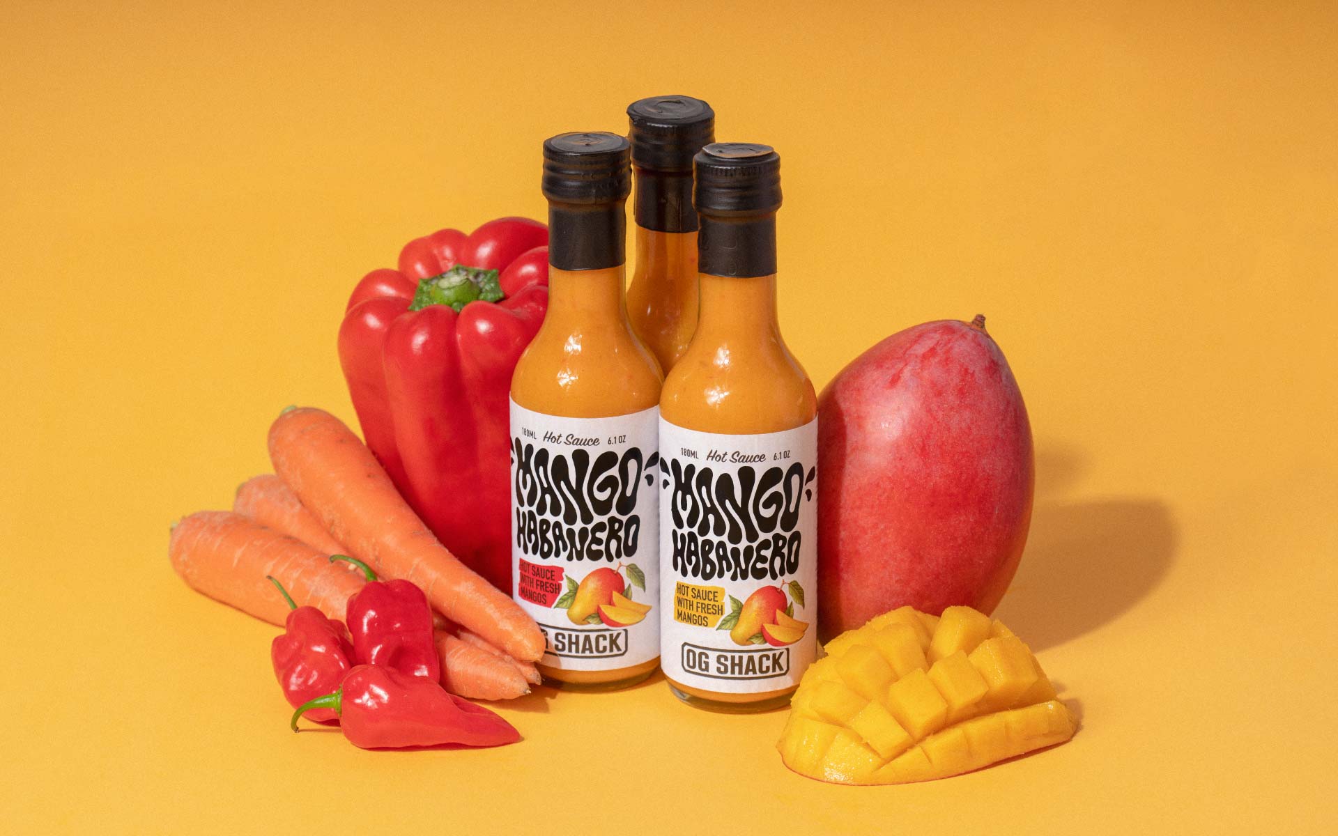
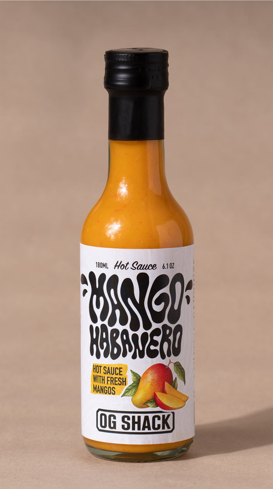
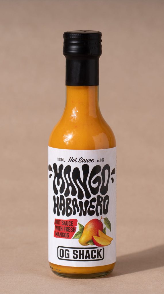
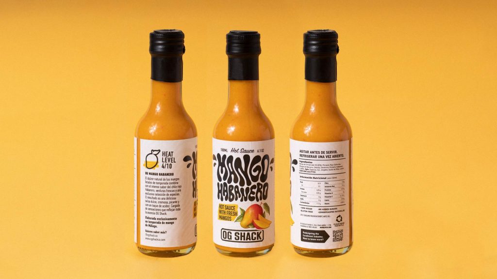
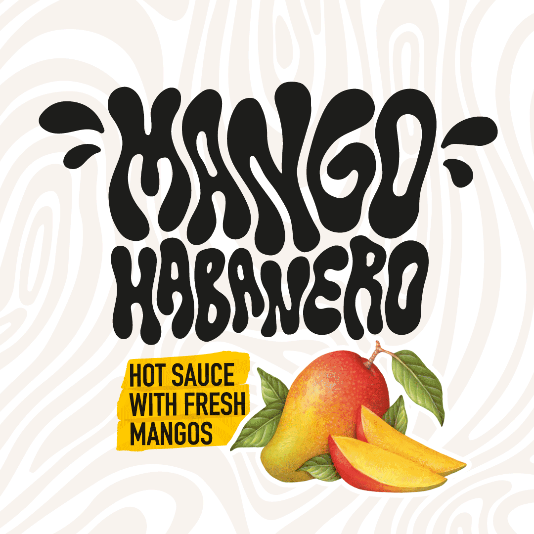
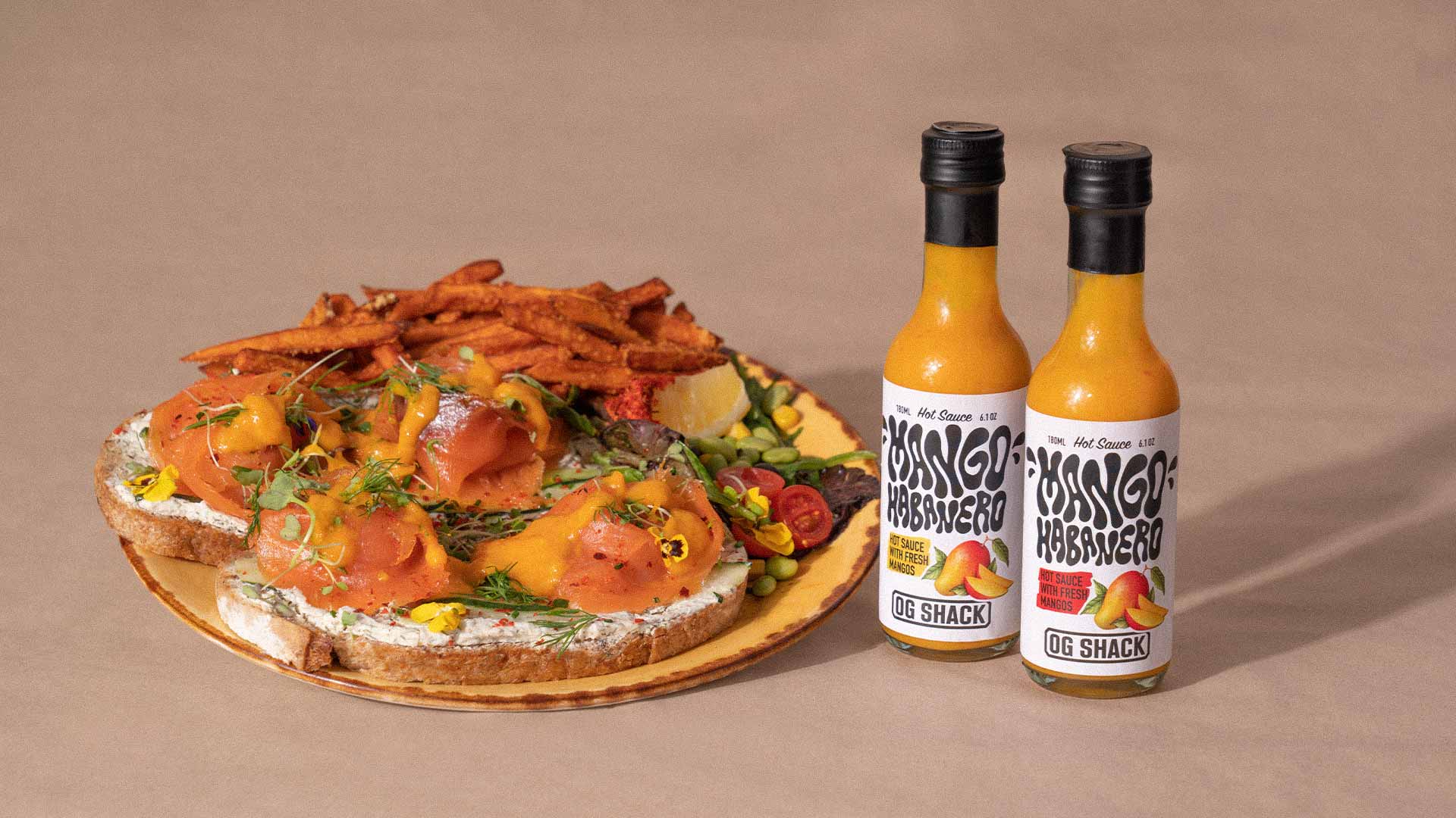
Una etiqueta para la salsa clásica de OG Shack «Mango Habanero». Querían que la etiqueta comunicara la fuerte personalidad de la marca, pero también el sabor de esta salsa picante. OG Mango Habanero es una salsa picante a base de mango que combina el dulzor de los mangos locales de Málaga en su punto óptimo de maduración con el sabroso picante del habanero. Esta salsa picante es dulce, ácida, picante, sabrosa y fresca.
La solución
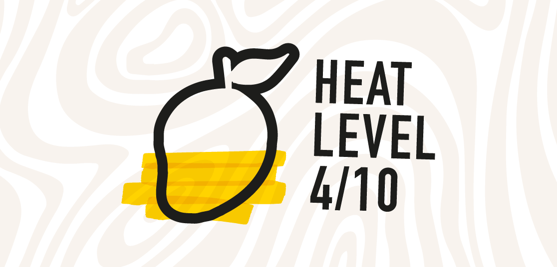
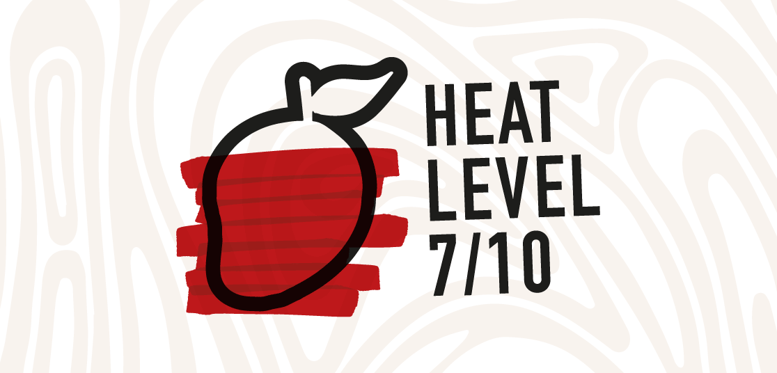
Una etiqueta con estilo y una presencia artesanal. Usando un lettering personalizado en la etiqueta, conseguimos mostrar su carácter y la originalidad de la marca. La etiqueta se inspira en el etiquetado vintage de alimentos, que combinaba ilustraciones de comida con lettering personalizado. Este lettering tiene un giro: añade la ilustración de la comida a modo de pegatina y mantiene un trazo minimalista pero ondulado. Incorporamos otro texto destacado en rojo o amarillo (según el nivel de picante) para reforzar la frescura de los mangos con los que se elabora la salsa.
Briefing y cimientos
Pola llevaba años dirigiendo producciones, pero sin una marca a la altura. Necesitaba más que un logo: necesitaba un sistema que le permitiera presentarse como una productora, no solo como un freelance. El objetivo: una estructura que pudiera crecer con él y una identidad que reflejara el trabajo que ya estaba haciendo.
Ya tenía el nombre: Balate. Un muro de piedra seca construido para nivelar terrenos en pendiente, la metáfora perfecta para un equipo que gestiona la complejidad de la producción para que el contenido fluya sin fricciones. De ese nombre surgió un briefing creativo claro: precisión, eficiencia y resultados que dan en el blanco.
El posicionamiento
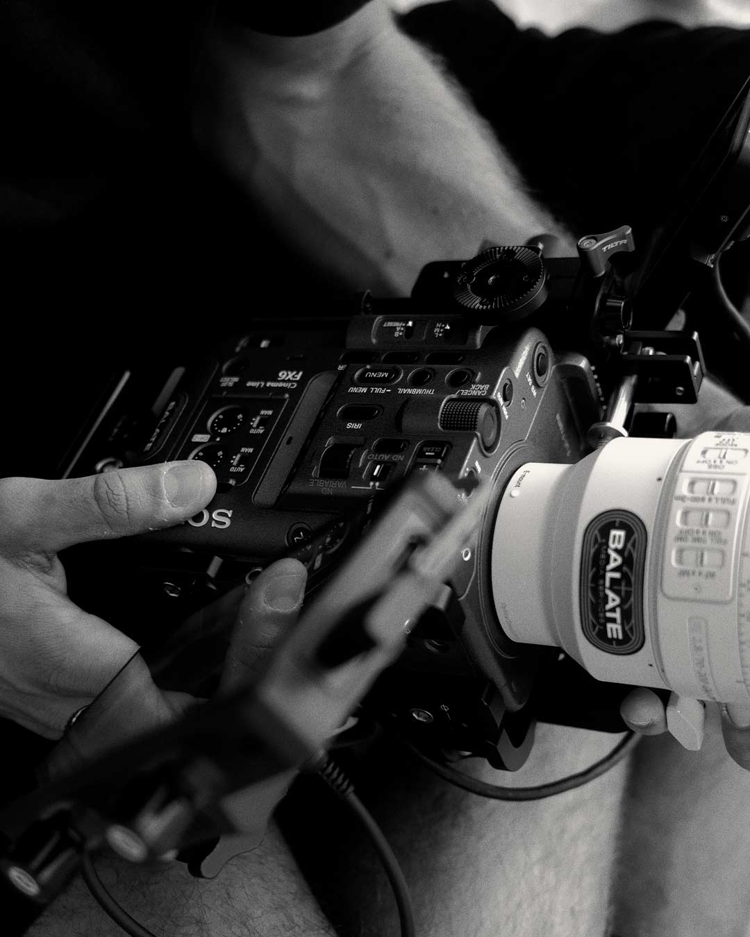
Mapeamos sus fortalezas frente al mercado. Mientras la mayoría de las productoras apuestan por el caos y la espontaneidad creativa, Pola invierte en rigor técnico, planificación, tiempos y recursos, para garantizar el resultado antes de que empiece el rodaje. Esa disciplina se convirtió en el diferenciador. Balate representa el control y la excelencia técnica, con alma. No diferente por el simple hecho de serlo. Simplemente, siempre en el objetivo.
La identidad
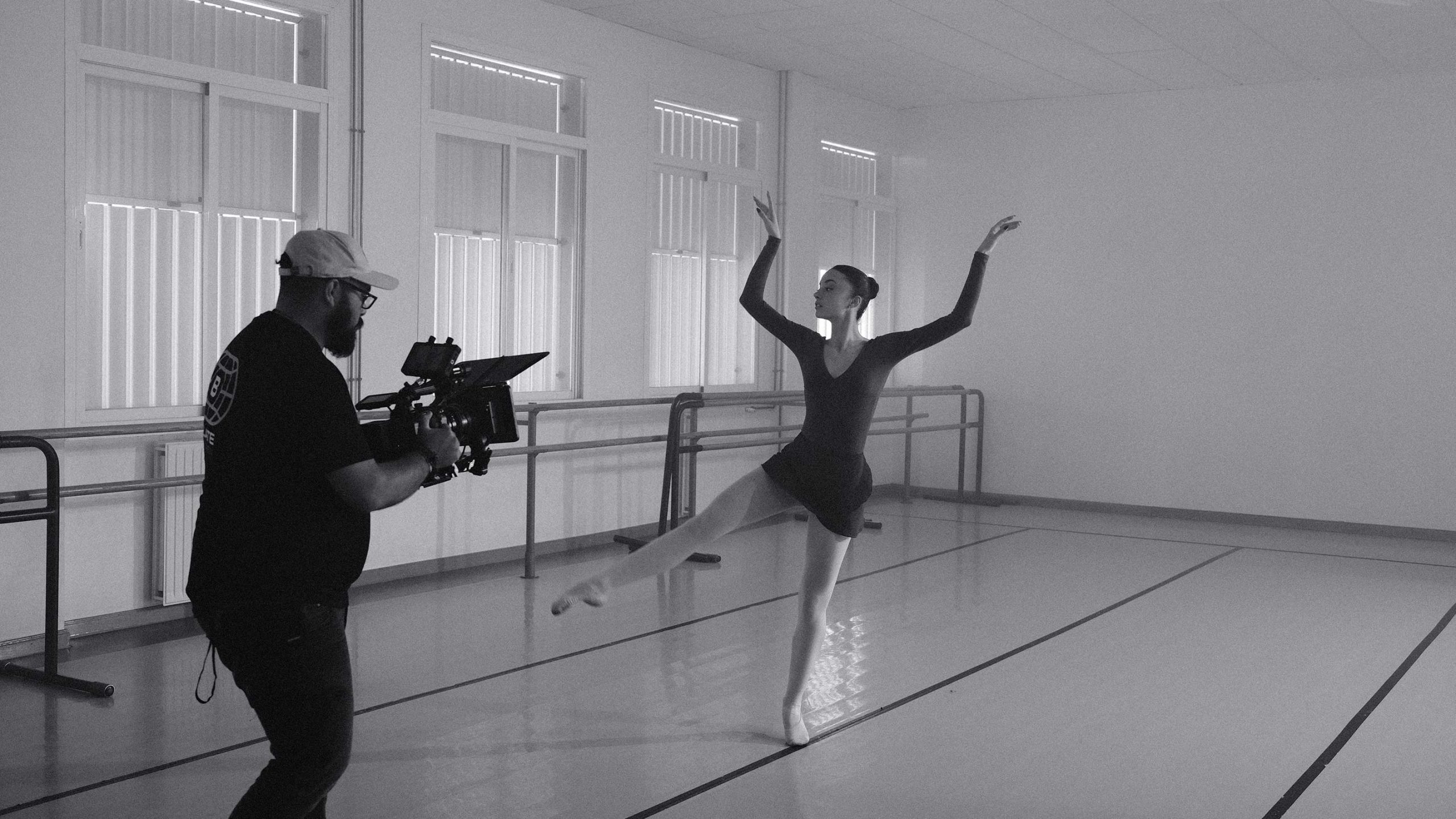
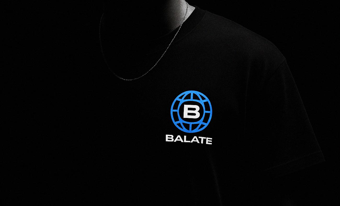
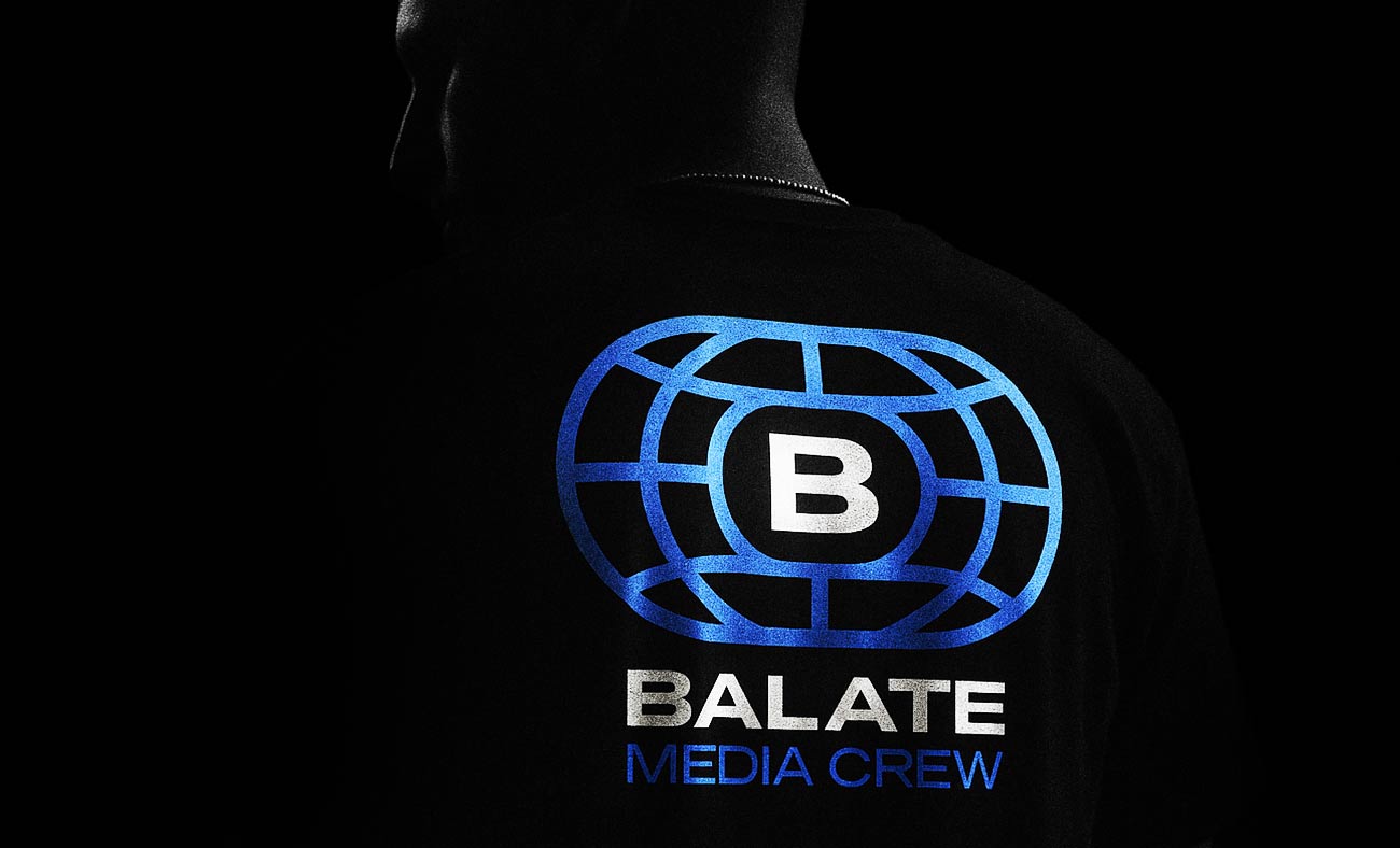
El universo visual bebe de los deportes de precisión como el tiro con arco o las carreras de relevos, disciplinas en las que cada decisión previa converge en un único momento decisivo. Un logo que fusiona un globo de media con la forma de una pista y una diana. Un sistema monocromo y monoespaciado, diseñado para la claridad y el impacto. Todo transmite control sin frialdad, estructura sin rigidez.
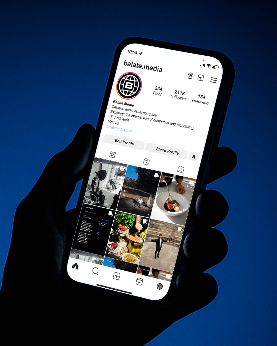
La web y las redes sociales siguen el mismo principio: que el trabajo lleve la voz. Los proyectos se presentan solo con lo esencial, con la profundidad disponible bajo demanda. Las animaciones gráficas en redes captan la atención sin competir con el metraje. Una sección Journal con fotos de viajes, experimentos y momentos entre rodajes ancla el universo visual y mantiene la mirada afilada.
El resultado
Desde su lanzamiento, Balate funciona como una marca totalmente autosuficiente. Presupuestar, publicar, presentar: todo sistematizado, todo coherente con la marca. Llegaron nuevos clientes, especialmente en el sector de la hostelería. El feedback ha sido constante: profesional, sólido, de confianza. Y Pola ahora puede centrarse en ejecutar su trabajo sabiendo que su marca se esta comunicando con claridad y solidez, sin que tenga que tomar decisiones en cada paso de su comunicación.